Table of Contents
- Why Typeface Choice Matters for Branding
- Key Criteria for Selecting a Brand-Typeface
- Step-by-Step Process: Choosing a Typeface for Branding
- Showcasing Typeface Options from Edric Studio for Branding Systems
- Common Mistakes in Typeface Choice & How to Avoid Them
- Conclusion
- References
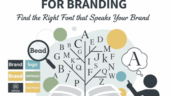
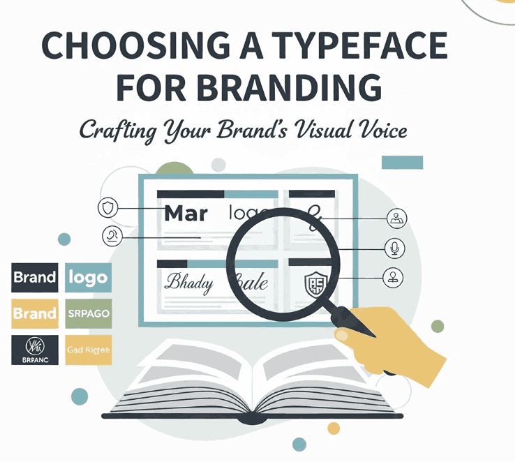
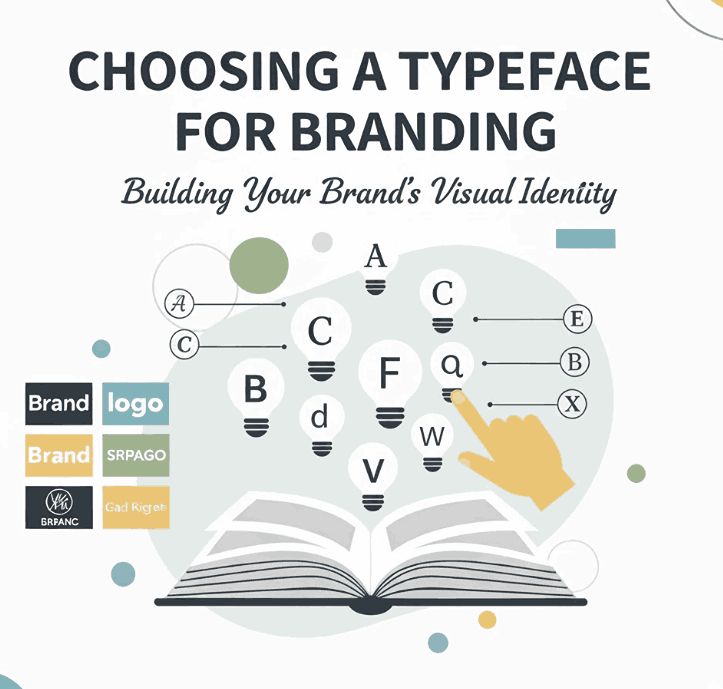
1. Why Choosing a Typeface Branding Matters
When you build a Choosing a Typeface Branding identity, you’re creating not only a message, but a personality. The typeface—the specific visual voice of your brand’s text—plays a major role in how that personality is perceived. In fact, choosing a typeface for branding is just as important as your logo, color palette and imagery.
As Monotype puts it:
“The right brand font will provide the versatility you need to deliver consistent brand expression across every touchpoint.”
And from the article on NineBlaess:
“A good brand font strikes the perfect balance between uniqueness, legibility, and a harmonious fit with your overall brand identity.”
For your studio, Edric Studio, which designs, creates and sells various typefaces, emphasising how to choose the right typeface for branding not only educates your audience but also positions your fonts as high-value tools for brand design.
2. Key Criteria for Selecting a Brand-Typeface
When you’re choosing a typeface for branding, here are the key criteria you should evaluate:
a) Brand Personality Alignment
First and most importantly: does the typeface visually reflect the brand’s character? Is your brand modern, classic, playful, luxurious, rugged? The typeface should mirror that tone. For example, script fonts may evoke elegance, while geometric sans-serifs express modernity.
b) Legibility, Versatility & Scope
The typeface must be readable across mediums (print, web, mobile) and scalable across sizes. Monotype highlights that brand fonts need to work “on virtually every piece of printed material and digital real estate your brand touches”.
c) Distinctiveness & Timelessness
A brand typeface needs to stand out, but not so trendy that it looks dated tomorrow. It must avoid fleeting stylistic fads. As the NineBlaess piece says: “Avoid fonts that can quickly become outdated. Your brand identity should stay relevant over time.”
d) Family Completeness & Multilingual Support
If you’re using one typeface across your brand, it helps if the font family offers a full range of weights, italics, language support, especially if your brand grows globally.
e) Licensing & Practical Use
Make sure the typeface you select is covered by the correct license for your usage: web, print, embedding, large signage, etc. Without this, the branding system may face legal or cost challenges.
f) Pairing & Hierarchy
A brand rarely uses a single typeface in isolation. You might need headline, sub-headline, body copy fonts. The chosen typeface must integrate well (or be paired) and support typographic hierarchy.
3. Step-by-Step Process: Choosing a Typeface Branding
Here’s a structured process you (and your clients/customers) can follow when selecting a typeface for branding:
- Define your brand values & tone
Write down three to five adjectives that describe your brand (e.g., trustworthy, energetic, artisanal, minimalist). This becomes your lens for evaluating fonts. - Audit your current typographic usage
What fonts do you currently use? Are they consistent? Are they legible across contexts? If you are redesigning, note what works and what doesn’t. - Shortlist candidate typefaces
Choose 3-5 fonts that align with your brand tone and criteria above. Considering factors like weights, versatility, language support. - Test in real brand contexts
Apply each candidate in your branding mockups: logo, website header, body text, packaging. Use real copy and devices. Monotype emphasises testing across touchpoints. - Evaluate practicality & performance
Assess readability, spacing, scalability, performance (especially for web use). Evaluate licensing costs and completeness of font family. - Choose primary and secondary typefaces
Select one primary brand typeface and, if needed, a secondary font to complement it for body copy or sub-headings. Ensure the two work well together. - Document the system
Once chosen, document your typeface usage: headline sizes, body sizes, spacing, color usage, allowable pairings. Consistency builds recognition.
By following this process, you reduce risk of mis-alignment between your typeface and your brand identity, and you also streamline font selection for design teams or clients.
4. Showcasing Options from Edric Studio for Choosing a Typeface Branding Systems
As part of your branding strategy, you may want to highlight some of your own font offerings that work effectively as brand typefaces. Here are four strong options:
- Always Find Font – A distinctive display typeface that can serve as a strong headline brand voice; ideal for when you want bold character.
- Blacked Font – A bold, impactful font for high-visibility branding applications; great for logos, titles and brand mark text.
- Seaways Font – A more refined or stylistic typeface (depending on design) that could support a premium brand tone or brand with more character.
- Bob Gerry Font – A versatile typeface that, depending on its weights and styles, could serve as body copy, subheadings or secondary brand typography.
By linking these fonts in the article, you demonstrate real-world options available via Edric Studio and provide design teams inspiration for typeface usage within a brand system.
5. Common Mistakes in Typeface Choice & How to Avoid Them
Even seasoned brands and designers can stumble when selecting a typeface for Choosing a Typeface Branding. Here are some common errors and mitigation tips:
- Mistake: Choosing a font purely based on aesthetics without testing readability or usage.
A beautiful font that cannot scale or fails online is a liability. - Mistake: Looking only at the logo or headline use, ignoring body copy or multilingual needs.
Brands expand; ensure your typeface family supports growth and language variety. - Mistake: Chasing trends instead of longevity.
Trendy fonts may date quickly, reducing brand relevance. NineBlaess warns: “Avoid fonts that can quickly become outdated.” - Mistake: Choosing too many typefaces or inconsistent pairings.
Over-using fonts dilutes brand cohesion. Stick to a solid system with primary + secondary. - Mistake: Ignoring licensing and technical constraints (especially for web use, mobile, etc.).
Ensure your font is licenced for all brand touchpoints and works technically (web, print, signage).
Recognising and avoiding these traps makes the difference between a strong, lasting brand typography system and one that falters.
6. Conclusion Choosing a Typeface Branding
Choosing a Typeface Branding is a strategic decision – not simply aesthetic. Your typeface shapes perception, supports brand voice, and must function consistently across all touchpoints. The process involves aligning with brand personality, checking technical and licensing criteria, testing on real contexts, and documenting usage to maintain consistency.
At Edric Studio, your collection of typefaces offers powerful options for designers and brands looking to establish or refresh their typographic voice. Whether it’s Always Find, Blacked, Seaways or Bob Gerry — these fonts can form the backbone of a sophisticated branding system.
When brands choose wisely, document thoroughly and use their typefaces consistently, they reinforce recognition and trust. Typeface choice becomes not just part of the brand identity—it is the visual voice of the brand.
7. References Choosing a Typeface Branding
- Monotype – Finding your type: How to pick the right font for your brand.
- Canva – Build your brand: How to choose the right fonts.
- Visme – The Ultimate Guide to Choosing Your Brand Fonts.
- Clay Global – Brand Guide Fonts: How to Select and Use Them Effectively.
- NineBlaess (Medium) – Everything You Need to Know About Choosing Brand Fonts.