Table of Contents
- Introduction
- What Is Typography and Why It Matters
- Core Typography Design Principles
- 3.1 Hierarchy
- 3.2 Contrast
- 3.3 Alignment
- 3.4 Spacing
- 3.5 Consistency
- How Typography Influences Branding & User Experience
- Best Practices for Choosing the Right Fonts
- Font Examples for Typography Projects (EdricStudio.com)
- Common Typography Mistakes to Avoid
- Conclusion
- References
- Yoast SEO Format (Title, Meta Description, Keywords, Category, Tags)
1. Introduction
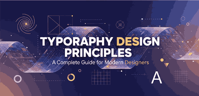
Typography Design Principles plays a crucial role in shaping how audiences perceive visual communication. From websites and branding to packaging and promotional materials, the principles of typography determine how effectively a message is delivered. Good typography enhances readability, organizes information, and strengthens brand identity—making it an essential skill for every graphic designer.
This article explores fundamental Typography Design Principles, practical tips, and real font examples sourced from EdricStudio.com to help you master impactful typographic layouts.
2. What Is Typography Design Principles and Why It Matters
Typography refers to the art and technique of arranging type to make written language readable, visually appealing, and effective in communication.
Strong typography provides:
- Clear hierarchy
- Visual consistency
- Emotional expression
- Professional brand presentation
- A better user experience
Whether you’re designing a website, poster, brand kit, or social media visual, typography choices directly influence how your message is interpreted.
3. Core Typography Design Principles
3.1 Hierarchy
Hierarchy helps guide readers through content by using different font weights, sizes, or colors to emphasize importance.
Examples:
- Titles should be larger and bolder
- Subheaders slightly smaller
- Body text clean and readable
3.2 Contrast
Contrast creates visual interest and clarity. This can be achieved through:
- Serif vs. sans-serif combinations
- Light vs. bold weights
- Large vs. small text sizes
3.3 Alignment
Proper alignment organizes information and creates visual order.
Common alignment styles:
- Left-aligned for paragraphs
- Centered for titles
- Grid-based layouts for balance
3.4 Spacing
Spacing includes kerning, tracking, and line spacing. Good spacing improves readability and avoids clutter.
Key tips:
- Add enough line height for long text
- Use consistent spacing between elements
- Adjust kerning for professional aesthetics
3.5 Consistency Typography Design Principles
Maintain the same typography system throughout the entire design. This builds brand recognition and keeps visuals clean.
Examples:
- Use a fixed font pairing
- Limit font variations (typically 2–3 fonts max)
- Apply consistent margins and styles
4. How Typography Design Principles Influences Branding & User Experience
Typography communicates personality. Even before reading the words, audiences subconsciously interpret the tone based on font characteristics.
- Elegant fonts → Luxury, premium branding
- Bold geometric fonts → Tech, modern, professional
- Handwritten fonts → Personal, creative, friendly
Typography also impacts user experience:
- Readability increases engagement
- Clean spacing improves comprehension
- Consistent styles strengthen trust
5. Best Practices for Choosing the Right Fonts
When selecting fonts for a project, consider:
✔ Brand personality
✔ Industry standards
✔ Readability across devices
✔ Font pairing harmony
✔ Licensing requirements
For professional use, premium fonts (such as those from EdricStudio) offer higher quality and unique styles.
6. Font Examples for Typography Design Principles Projects (EdricStudio.com)
Here are recommended fonts to demonstrate various design principles:
1. Northcliff Serif Fonts
A sophisticated serif family suitable for editorial and branding layouts that require elegance.
2. Axton Sans Serif Fonts
A clean and modern sans-serif typeface, perfect for UI/UX and corporate presentations.
3. Alaqua Sans Serif Fonts
Geometric and minimalistic, ideal for sleek and modern brand identities.
4. Night Feel Handwriting Font
A stylish handwritten script for creative projects, quotes, and personal branding.
7. Common Typography Design Principles Mistakes to Avoid
To keep your designs clean and professional, avoid:
❌ Using too many fonts
❌ Ignoring spacing rules
❌ Poor contrast between text and background
❌ Inconsistent alignment
❌ Using decorative fonts for long paragraphs
These issues reduce readability and make designs look unprofessional.
8. Conclusion
Typography plays a fundamental role in visual communication. By understanding hierarchy, contrast, alignment, spacing, and consistency, designers can elevate their work significantly. Whether you’re working on branding, UI design, marketing materials, or digital content, using high-quality fonts is essential.
Explore more premium typefaces at EdricStudio.com to bring your typography projects to the next level.
9. References
- Canva — Typography
- MyFonts — Fontology
- TypeWolf — Guides & Resources
- Material Design — The type of system
- Adobe — The power of typography in design.