Table of Contents
- Introduction
- What Is Leading in Typography?
- The Origin of Leading: Why the Name Matters
- Why Leading Is Important in Modern Design
- How to Adjust Leading Effectively
- Common Leading Mistakes Designers Must Avoid
- Best Font Styles to Demonstrate Leading
- Examples Using EdricStudio Fonts
- Practical Tips for Perfect Leading in Your Projects
- Conclusion
- References
1. Introduction What is Leading Typography
What is Leading Typography is more than just choosing beautiful fonts — it is the art of arranging text to make it readable, aesthetic, and impactful. One of the most essential yet often misunderstood concepts in typography is leading. Whether you’re creating website layouts, branding assets, posters, or editorial designs, leading plays a crucial role in how your message is perceived.
In this article, we’ll explore what leading is, how it influences readability, and how you can master it using examples from selected fonts available on EdricStudio.
2. What is Leading Typography?
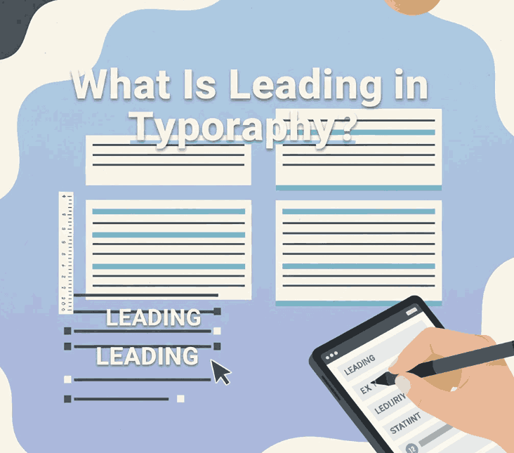
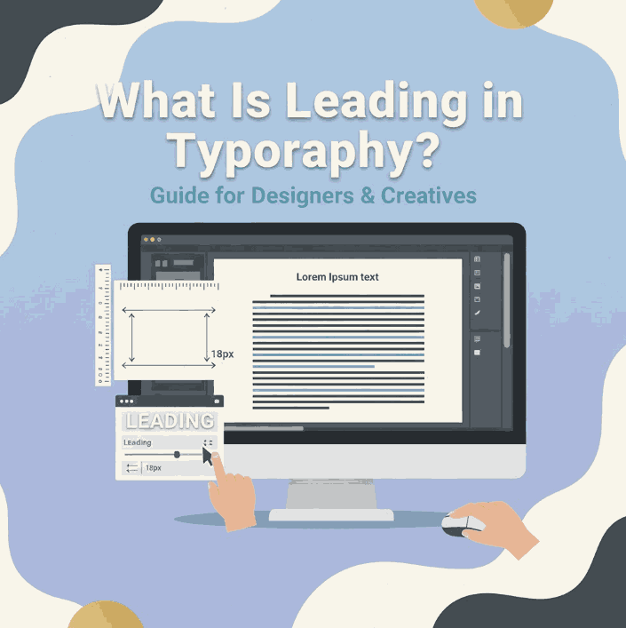
Leading (pronounced “ledding”) refers to the vertical spacing between lines of text.
In digital design software such as Adobe Illustrator, Photoshop, or Figma, leading is often labeled as line spacing or line height. Increasing or decreasing this spacing dramatically affects the readability, tone, and visual rhythm of your typography.
Simple Definition:
👉 Leading = The distance between the baselines of two lines of text.
When the leading is too tight, text looks cramped and becomes hard to read. When it’s too loose, it creates visual disconnection and reduces reading flow.
3. The Origin of What is Leading Typography: Why the Name Matters
The term comes from the traditional printing era, where strips of real lead metal were inserted between lines of movable type to create space.
This historical background emphasizes how vital vertical spacing has always been in typography — from physical printing presses to digital design tools.
4. What is Leading Typography Important in Modern Design
Proper leading enhances:
✔ Readability
Text becomes easier to scan, especially in long paragraphs.
✔ Aesthetic Balance
Appropriate spacing creates a harmonious, clean look.
✔ Visual Hierarchy
It helps guide the viewer’s eye through the content.
✔ Accessibility
Good leading improves legibility for users with visual challenges.
✔ Brand Perception
Professional spacing = professional design.
Poor leading can make even the best fonts look unpolished, while great leading elevates the entire design.
5. How to Adjust What is Leading Typography Effectively
Leading is not a one-size-fits-all rule. Here are general guidelines:
1. Consider Font Style
Different fonts require different leading values:
- Serif fonts often need more leading.
- Sans serif fonts can use slightly tighter leading.
- Script fonts depend on curves and flourishes, requiring wider spacing.
2. Use the 120% – 145% Rule
A common guideline:
Leading = 1.2 × font size to 1.45 × font size
3. Adjust Based on Use Case
- Print body text → more leading
- Digital content → moderate leading
- Headlines → tighter leading
6. Common What is Leading Typography Mistakes Designers Must Avoid
❌ Too Tight Leading
Cramps the text, reduces readability, and creates visual tension.
❌ Too Loose Leading
Causes disconnection between lines, making the text feel scattered.
❌ Inconsistent Leading
Breaks visual rhythm and looks unprofessional.
❌ Ignoring Font Anatomy
Fonts with tall ascenders or deep descenders need additional space.
7. Best Font Styles to Demonstrate What is Leading Typography
To illustrate leading effectively, you need fonts with good character structure, clear baselines, and distinct ascenders/descenders.
Here are four high-quality fonts from EdricStudio that are perfect for showcasing leading adjustments:
1. Lord Madame Font (Sans Serif)
Clean, modern, and elegant. Great for body text examples.
2. Strange Cool Font (Modern Sans Serif)
Comes with multiple styles—great for comparing tight vs. loose leading.
3. Bandung Retro Font (Retro Script)
Script fonts are perfect for demonstrating the effects of additional leading.
4. Classy Script Font (Calligraphy Script)
Shows how flourishes and curves influence vertical spacing.
8. Examples Using EdricStudio Fonts
Below are practical ways to demonstrate leading using the recommended fonts:
✔ Body Text Example (Lord Madame Font)
- Tight Leading: Suitable for modern, compact layouts
- Normal Leading: Best for long paragraphs
- Loose Leading: Clean, airy look for elegant design
✔ Headline Example (Strange Cool Font)
- Tight leading creates a bold, impactful look
- Wider leading introduces a sleek, contemporary feel
✔ Decorative Text (Bandung Retro + Classy Script)
Scripts often require:
- +10% to +25% additional leading
This prevents decorative letters from overlapping.
9. Practical Tips for Perfect Leading in Your Projects
- ✔ Always test leading on actual paragraphs, not single lines
- ✔ Consider audience age (older readers benefit from looser leading)
- ✔ Adjust leading before kerning and tracking
- ✔ For web design, use
line-heightvalues (1.3 – 1.6 recommended) - ✔ Use consistent leading across sections for harmony
- ✔ Add extra leading when pairing serif + script fonts
10. Conclusion
Understanding leading in typography is essential to creating visually balanced, readable, and professional designs. Whether you’re working on branding, editorial layouts, UX/UI, or packaging, proper line spacing can transform the entire aesthetic.
Using high-quality fonts—like Lord Madame, Strange Cool, Bandung Retro, and Classy Script from EdricStudio—makes it easier to experiment with leading and achieve the perfect visual rhythm.
Mastering leading is mastering readability — and ultimately mastering design itself.