Table of Contents
- Introduction
- What Is Typography?
- Why Understanding Typography Elements Matters
- Core Typography Elements and Terms
- Typeface vs Font
- Serif and Sans Serif
- Baseline
- Cap Height and X-Height
- Ascenders and Descenders
- Spacing Elements in Typography
- Leading
- Kerning
- Tracking
- Typography Hierarchy and Contrast
- Font Weight, Style, and Emphasis
- Font Examples from EdricStudio
- Common Typography Mistakes to Avoid
- Conclusion
- References
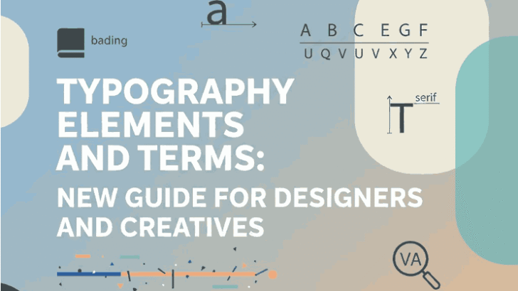
1. Introduction Typography Elements and Terms
Typography Elements and Terms is the backbone of visual communication. Whether you are designing a logo, website, poster, or social media graphic, the way text is structured, spaced, and styled directly affects how your message is perceived.
To master typography, designers must first understand the essential typography elements and terms. This guide explains the most important typography fundamentals in a clear and practical way—supported by real font examples from EdricStudio.
2. What Is Typography Elements and Terms?
Typography is the art and technique of arranging type to make written language legible, readable, and visually appealing. It involves selecting typefaces, adjusting spacing, organizing hierarchy, and creating balance between text and design.
Typography is not only about aesthetics—it directly influences usability, accessibility, and brand identity.
3. Why Understanding Typography Elements and Terms Matters
Knowing typography terms helps designers:
- Communicate ideas clearly
- Improve readability and user experience
- Build strong visual hierarchy
- Create professional and consistent designs
- Choose the right fonts for the right purpose
Without understanding typography fundamentals, even beautiful fonts can fail to deliver the intended message.
4. Core Typography Elements and Terms
Typeface vs Font
- Typeface: The overall design of a letter family (e.g., Lord Madame)
- Font: A specific style within a typeface (e.g., bold, italic)
Understanding this difference is essential when selecting fonts for projects.
Serif and Sans Serif
- Serif fonts include small strokes at the ends of letters, often used in print.
- Sans serif fonts are clean and modern, ideal for digital design and data-heavy layouts.
Most modern UI and infographic designs rely on sans serif fonts.
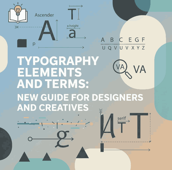
Baseline
The baseline is the invisible line on which letters sit. Consistent baselines create clean, professional typography layouts.
Cap Height and X-Height
- Cap height: Height of uppercase letters
- X-height: Height of lowercase letters like “x”
Fonts with larger x-heights are generally more readable at small sizes.
Ascenders and Descenders
- Ascenders: Parts of letters that extend above the x-height (b, d, h)
- Descenders: Parts that extend below the baseline (g, p, y)
These elements affect spacing and line height decisions.
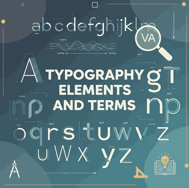
5. Spacing Typography Elements and Terms
Leading
Leading refers to the vertical space between lines of text. Proper leading improves readability and visual comfort.
Too tight → text feels cramped
Too loose → text loses flow
Kerning
Kerning is the adjustment of space between individual letter pairs. Good kerning ensures visual balance between characters.
Tracking
Tracking adjusts spacing across an entire word or paragraph. Designers use tracking to improve readability or create stylistic effects.
6. Typography Elements and Terms Hierarchy Contrast
Typography hierarchy helps readers scan content easily. Designers use hierarchy to indicate importance through:
- Font size
- Font weight
- Color
- Spacing
- Alignment
A strong hierarchy guides the reader naturally from headline to body text.
7. Font Weight, Style, and Emphasis
Font weight and style are essential tools for emphasis and contrast:
- Light → elegance and minimalism
- Regular → readability
- Bold → emphasis and attention
- Italic → secondary emphasis
Using weight variations wisely helps create clarity without clutter.
8. Typography Elements and Terms Font Examples from EdricStudio
To better understand typography elements and terms, here are professional font examples from EdricStudio that work perfectly for demonstrations:
1. Lord Madame Font
A clean and elegant sans serif font ideal for body text, leading, and readability examples.
2. Strange Cool Font
A versatile modern sans serif with multiple styles—perfect for explaining kerning, tracking, and hierarchy.
3. AXTON Sans Serif Fonts
A bold, modern sans serif ideal for typography hierarchy, contrast, and headline examples.
4. Gliford Retro Bold Sans Serif
A strong display font suitable for demonstrating font weight, emphasis, and visual impact.
How to Use These Fonts in the Article
- Use Lord Madame for paragraph readability and leading
- Compare Strange Cool Regular vs Bold for kerning and hierarchy
- Apply AXTON for headlines and subheadings
- Use Gliford to demonstrate bold emphasis and display typography
9. Common Typography Elements and Terms Mistakes to Avoid
- Using too many fonts in one layout
- Ignoring spacing and alignment
- Poor contrast between text and background
- Overusing decorative fonts
- Inconsistent hierarchy
Good typography is subtle—when done right, it feels natural and effortless.
10. Conclusion
Understanding typography elements and terms is essential for every designer. From spacing and hierarchy to font anatomy and weight, these fundamentals shape how people experience written content.
By using high-quality fonts like Lord Madame, Strange Cool, AXTON, and Gliford from EdricStudio, designers can apply typography principles effectively while maintaining a professional and modern aesthetic.
Master typography, and your designs will communicate more clearly, confidently, and creatively.
11. References
- Typewolf Typography Guide
- Wikipedia – Typography
- Smashing Magazine – Typography
- Google Fonts Knowledge – Typography