Table of Contents
- Introduction: Why Typography Issues Matter in Design
- What Are Common Typography Issues in Design?
- Poor Readability and Legibility
- Inconsistent Typography Hierarchy
- Overusing Decorative Fonts
- Incorrect Line Spacing and Kerning
- Weak Font Pairing Choices
- Using the Right Fonts to Avoid Typography Issues
- Conclusion
- References
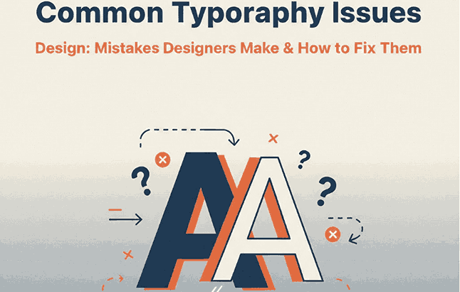
1. Introduction: Why Common Typography Issues Design Matter
Typography is one of the most critical elements in visual communication. No matter how strong a concept or layout may be, poor typography can instantly reduce clarity, professionalism, and user engagement. Many designers — especially beginners — struggle with common typography issues in design that negatively affect readability and overall aesthetics.
Understanding these issues and knowing how to fix them is essential for graphic designers, web designers, branding specialists, and creative professionals. This article explores the most common typography issues in design and explains how proper font selection and usage can significantly improve visual outcomes.
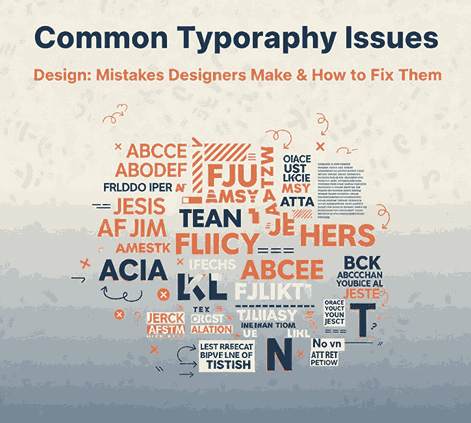
2. What Are Common Typography Issues Design?
Common typography issues in design usually occur when fonts are used without considering hierarchy, spacing, readability, or context. These mistakes can confuse readers, weaken branding, and reduce the effectiveness of communication.
Some typography problems are subtle, such as inconsistent spacing, while others are more obvious, like using decorative fonts for long paragraphs. Recognizing these issues is the first step toward mastering professional typography.
3. Poor Common Typography Issues Design Readability and Legibility
One of the most frequent typography mistakes is poor readability. This often happens when designers choose fonts that are visually attractive but difficult to read, especially at small sizes.
Problems that reduce readability include:
- Overly decorative or complex letterforms
- Low contrast between text and background
- Fonts not designed for body text
Readability is especially important for long-form content such as articles, product descriptions, or websites. Fonts should support the message rather than compete with it.
4. Inconsistent Common Typography Issues Design Hierarchy
Typography hierarchy helps readers understand what information is most important. Without a clear hierarchy, content becomes overwhelming and difficult to scan.
Common hierarchy issues include:
- Headings that look too similar to body text
- Inconsistent font sizes across sections
- Lack of visual contrast between titles, subtitles, and paragraphs
A well-structured hierarchy guides the reader’s eye and creates a smooth reading experience.
5. Overusing Common Typography Issues Design Decorative Fonts
Decorative fonts can be powerful when used correctly — but overusing them is a common typography issue in design. Fonts with extreme styles, effects, or textures should be used sparingly and primarily for headlines or accent text.
Using decorative fonts for body text often leads to:
- Eye strain
- Reduced readability
- Unprofessional appearance
Designers should balance creativity with functionality to ensure text remains accessible.
6. Incorrect Line Spacing and Kerning
Spacing issues are among the most overlooked typography problems. Even a well-designed font can look poor if spacing is not adjusted correctly.
Key spacing mistakes include:
- Line spacing that is too tight or too loose
- Poor kerning between letter pairs
- Inconsistent spacing across paragraphs
Proper spacing improves readability and gives designs a polished, professional look.
7. Weak Font Pairing Choices
Font pairing is essential for creating contrast and visual harmony. Many typography issues arise when fonts clash instead of complementing each other.
Common font pairing mistakes:
- Using fonts with similar personalities
- Mixing too many font styles in one layout
- Combining fonts that compete for attention
Effective font pairing usually involves combining fonts with contrasting roles, such as a strong headline font and a clean body font.

8. Using the Right Fonts to Avoid Common Typography Issues Design
Choosing professional, well-designed fonts is one of the easiest ways to avoid common typography issues in design. At Edric Studio, we design fonts that help designers achieve clarity, hierarchy, and visual impact.
Here are some font examples suitable for demonstrating typography solutions:
Blacked Font
A modern display font ideal for headlines and titles that require strong visual impact and high contrast.
Bubble Effect Font
A bold decorative font that works best for short accent text, allowing designers to demonstrate how decorative fonts should be used carefully.
Aghnesta Font Trio
A versatile font family perfect for showing proper hierarchy and font pairing within a single design system.
Syllia Calligraphy Font
An elegant calligraphy font suitable for quotes or highlights, demonstrating the correct context for script typography.
Using the right font for the right purpose significantly reduces typography mistakes and enhances the overall design quality.
9. Conclusion
Typography plays a vital role in how designs communicate ideas and emotions. Many common typography issues in design stem from poor font choices, weak hierarchy, improper spacing, and lack of readability awareness.
By understanding these mistakes and applying best practices — supported by high-quality fonts — designers can create more effective, professional, and engaging visual experiences. Strong typography not only improves aesthetics but also builds trust and credibility across creative projects.
10. References
- Wikipedia – Typography
- Interaction Design Foundation – The Power of Typography
- Smashing Magazine – Typography Guidelines for Designers
- Just the Skills – Typographic Design Patterns and Common Practices