Table of Contents
- Introduction
- What Is Typography?
- Why Typography Matters for Beginners
- Essential Typography Terms You Should Know
- Typography Tutorials for Beginners: Step-by-Step
- Step 1: Choose the right typeface
- Step 2: Learn about contrast
- Step 3: Practice alignment
- Step 4: Use hierarchy for emphasis
- Step 5: Combine fonts correctly
- Typography Mistakes Beginners Should Avoid
- Recommended Fonts for Typography Practice
- Conclusion
- References
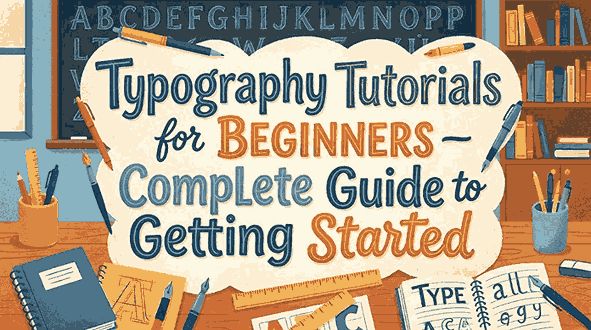
1. Introduction Typography Tutorials for Beginners
If you are new to design, typography can feel overwhelming. With thousands of fonts, complex rules, and visual decisions, knowing where to start is difficult. This guide presents practical typography tutorials for beginners, breaking down concepts into simple, actionable steps.
Typography plays a key role in branding, websites, posters, ads, and any design involving text. Understanding typography basics helps make your design readable, aesthetic, and professional.
In this article, you’ll learn:
- What typography is
- Key terminology for beginners
- Step-by-step typography tutorials
- Common rookie mistakes
- Examples of professional fonts to try
- Trusted resources for continued learning
2. What Are Typography Tutorials for Beginners?
Typography refers to the art and technique of arranging text so written language is readable and visually appealing.
It includes decisions about:
- Typeface and font selection
- Size and spacing
- Alignment
- Hierarchy
- Layout
Good typography communicates message tone and improves user experience, especially in branding and digital interfaces.
3. Why Typography Tutorials for Beginners Matters
Typography is more than choosing a pretty font. It affects how users perceive your brand and content.
Typography improves:
✓ readability
✓ professionalism
✓ emotional impact
✓ visual hierarchy
✓ accessibility
Beginners who learn typography early build stronger design foundations for future projects.
4. Essential Typography Tutorials for Beginners Terms You Should Know
Before starting tutorials, learn these basics:
- Typeface: The style of lettering (example: Serif, Sans Serif, Script).
- Font: The specific typeface version including weight and size.
- Kerning: Space between individual letters.
- Leading/Line spacing: Vertical space between lines of text.
- Hierarchy: Visual ranking of elements through size/weight/style.
- Contrast: Difference between elements to draw attention.
Understanding these terms helps new designers follow instructions correctly.
5. Typography Tutorials for Beginners
Below are beginner-friendly steps to practice typography effectively.
Step 1: Choose the Right Typeface
Select a typeface appropriate for your message.
Examples:
- Serif fonts → formal or printed reading
- Sans serif fonts → modern and digital
- Script fonts → creative, elegant feel
To practice, try professional fonts available on Edric Studio:
These fonts allow beginners to explore various styles and visual personalities.
Step 2: Learn About Contrast
Contrast is essential for readability and hierarchy.
Contrast can be created using:
- size
- weight
- style (italic/bold)
- color
- spacing
Good contrast helps guide readers through your layout.
Step 3: Practice Alignment
Typography alignment influences balance and readability.
Common alignments:
- Left aligned
- Right aligned
- Centered
- Justified
Avoid mixing too many alignments in one layout to prevent clutter.
Step 4: Use Hierarchy for Emphasis
Hierarchy directs attention to the most important text first.
Use hierarchy through:
- heading sizes
- bold weights
- uppercase vs lowercase
- spacing
Example:
Title → Subtitle → Body text
Step 5: Combine Fonts Correctly
Font pairing creates visual interest.
Basic rules:
- Don’t mix too many fonts (2–3 maximum)
- Pair contrasting styles, not similar ones
- Maintain consistency across pages
Good beginner pairings:
- Serif + Sans Serif
- Sans Serif + Script for accent
Try pairing Blacked (bold sans serif) with Aghnesta (script) for interesting contrast.
6. Mistakes Typography Tutorials for Beginners Should Avoid
Avoid common pitfalls:
✕ Using too many fonts
✕ Poor color contrast
✕ Incorrect line spacing
✕ Letters too tight or too loose
✕ Ignoring alignment consistency
Good typography is intentional, not random.
7. Recommended Fonts for Typography Tutorials for Beginners Practice
These fonts from Edric Studio provide diverse styles for practicing:
- Blacked Font (strong, modern)
- Bubble Effect Font (playful display)
- Aghnesta Font Trio (elegant script + serif combo)
- Syllia Calligraphy Font (premium calligraphy)
Using professional fonts makes practice results more appealing and realistic.
8. Conclusion
Typography is the foundation of powerful design, and beginners who master it gain an advantage in branding, UI, and visual communication.
By following the tutorials in this guide—understanding contrast, alignment, hierarchy, and proper font pairing—you can improve your typography immediately.
Practice using professional fonts from Edric Studio to elevate your designs and experience the impact of strong text visuals.
Typography mastery starts with practice — and now you have everything to begin.
9. References
- Google Fonts – Knowledge
- AIGA – Professional Design Articles
- Adobe – Typography Fundamentals
- Smashing Magazine – Typography Guides
- Canva Design School – Typography Lessons