Table of Contents
- Introduction to Typography Spacing
- What Are Typography Spacing Guidelines?
- Why Spacing Is Critical in Typography
- Key Types of Typography Spacing
- Line Spacing (Leading) Best Practices
- Letter Spacing (Tracking & Kerning) Rules
- Paragraph and Layout Spacing Tips
- Font Examples for Typography Spacing from Edric Studio
- Common Typography Spacing Mistakes to Avoid
- Conclusion
- References
1. Introduction to Typography Spacing Guidelines
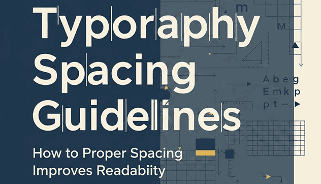
Typography Spacing Guidelines is not only about choosing beautiful fonts—it’s also about how text breathes on the page. Typography spacing guidelines define how letters, words, lines, and paragraphs interact visually. Proper spacing improves readability, enhances user experience, and creates professional, balanced designs.
In digital environments where users skim content quickly, good spacing can be the difference between content that feels inviting and content that feels overwhelming.

2. What Are Typography Spacing Guidelines?
Typography spacing guidelines are a set of design principles that control the distance between:
- Letters
- Words
- Lines of text
- Paragraphs
- Text blocks and surrounding elements
These guidelines help designers achieve visual clarity, consistency, and hierarchy. Whether you’re designing a website, UI, poster, or brand system, spacing plays a fundamental role in how typography performs.
3. Why Is Critical Typography Spacing Guidelines
Spacing directly affects how users perceive and consume content. Proper spacing:
- Improves readability and scanning
- Reduces eye fatigue
- Creates clear visual hierarchy
- Makes content feel organized and premium
- Enhances accessibility for all users
Poor spacing, on the other hand, can make even high-quality fonts look unprofessional.
4. Key Types of Typography Spacing Guidelines
To master typography spacing, designers should understand these core spacing types:
✔ Line Spacing (Leading)
The vertical space between lines of text.
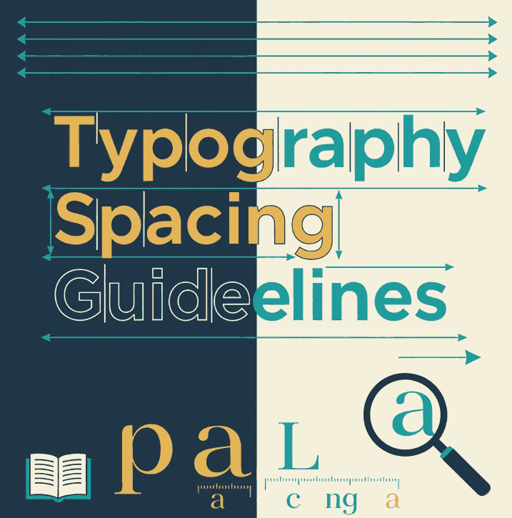
✔ Letter Spacing (Tracking)
The overall spacing applied to groups of letters.
✔ Kerning
The space between individual letter pairs.
✔ Paragraph Spacing
The vertical distance between text blocks.
Each type of spacing contributes to balance and clarity in typography.
5. Line Spacing (Leading) Best Practices
Line spacing determines how comfortably text can be read, especially on screens.
Recommended guidelines:
- Use 120%–160% of the font size for body text
- Increase line spacing for longer paragraphs
- Use tighter leading for large display headings
For example, a 16px body font works best with 24–26px line height. Proper leading prevents lines from visually colliding and improves reading flow.
6. Letter Spacing (Tracking & Kerning) Rules
Letter Spacing (Tracking)
- Increase tracking slightly for uppercase text
- Avoid excessive spacing in body text
- Use moderate tracking for headlines and UI labels
Kerning
- Adjust kerning for display fonts and logos
- Watch for awkward gaps between letters like AV, To, or Wa
- Always review typography visually—not just numerically
Good tracking and kerning create smooth rhythm and consistency across text.
7. Paragraph and Layout Typography Spacing Guidelines Tips
Paragraph spacing helps readers understand content structure.
Best practices include:
- Add space between paragraphs instead of using line breaks
- Maintain consistent margins and padding
- Keep line length between 50–75 characters
- Use whitespace strategically to guide the eye
Whitespace is not empty space—it’s a powerful design tool.
8. Font Examples for Typography Spacing Guidelines from Edric Studio
Below are high-quality fonts from Edric Studio that work perfectly for demonstrating typography spacing principles:
🔹 Botnet Font
A bold futuristic font with strong letterforms, ideal for showcasing tracking and kerning in display typography.
🔹 Planet View Font
Clean modern display font with consistent spacing, perfect for spacing examples in headlines and posters.
🔹 Verwalter Futuristic Font
A futuristic sans serif font with structured geometry, great for explaining spacing consistency in modern layouts.
🔹 Gracetians Sans Serif Font
A versatile sans serif display font with excellent balance, suitable for demonstrating line spacing and paragraph structure.
These fonts show how well-designed spacing elevates typography across digital and print applications.
9. Common Typography Spacing Guidelines Mistakes to Avoid
Even experienced designers make spacing mistakes. Avoid these common issues:
- Overly tight line spacing
- Excessive letter spacing in body text
- Inconsistent paragraph spacing
- Ignoring spacing on mobile screens
- Relying only on default font settings
Always review typography across devices and screen sizes.
10. Conclusion
Typography spacing guidelines are essential for creating readable, professional, and visually appealing designs. By controlling line height, letter spacing, kerning, and paragraph spacing, designers can dramatically improve user experience and visual hierarchy.
Fonts from Edric Studio are crafted with balanced spacing in mind, making them excellent choices for designers who value both aesthetics and performance.
11. References
- A list apart – On Web Typography
- Developer Mozilla – CSS text styling
- Material Design – The type of system
- Just the Skills – 20 Essential Typography Rules Before Developing Your Skillset