Table of Contents
- Introduction
- Why Font Pairing Matters in Design
- Key Principles for Successful Font Pairing
- Types of Font Pairing to Try
- How to Choose Fonts That Work Together
- Example Font Pairings Using Edric Studio Fonts
- Common Mistakes in Font Pairing
- Best Practices for Consistent Typography
- Final Thoughts
- References
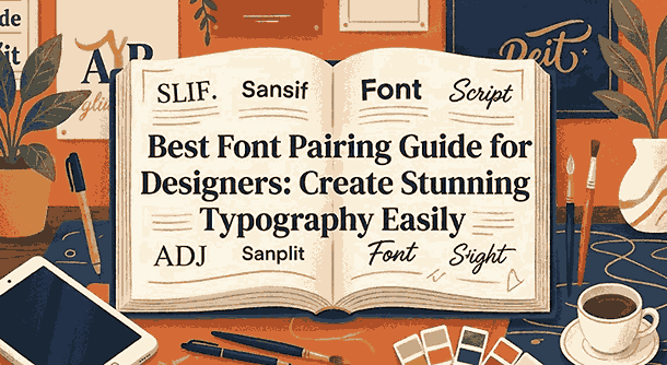
1. Introduction Best Font Pairing Guide
Best Font Pairing Guide is one of the most powerful skills in typography. Choosing the right combination of typefaces can strengthen your brand style, improve readability, and make your entire design look intentionally crafted.
However, many designers—especially beginners—struggle to choose fonts that complement each other instead of competing visually. This Best Font Pairing Guide will walk you step-by-step through principles, pairing strategies, and examples you can try today using fonts from Edric Studio.
Whether you design logos, posters, UI, packaging, or social media content, mastering font pairing will elevate every project.

2. Why Best Font Pairing Guide Matters in Design
Font pairing is more than just choosing two random typefaces. Good font combinations:
- create hierarchy
- guide the reader’s eye
- reinforce tone and personality
- support strong brand identity
- increase clarity and legibility
When fonts clash, the design feels amateur, confusing, and visually overwhelming. That is why pairing fonts intentionally is essential for professional designers.
The right pairing should feel natural and harmonious while still providing contrast that enhances the message.
3. Key Principles for Successful Best Font Pairing Guide
Before pairing fonts, understand the fundamentals. Professional designers follow principles like:
✔ Contrast
Use differences in weight, style, or classification to create interest.
✔ Harmony
Fonts should share similar proportions or moods to avoid chaos.
✔ Purpose
Each font must serve a specific role, such as heading vs body text.
✔ Readability
Avoid overly decorative fonts for body paragraphs.
✔ Consistency
Maintain alignment, spacing, and style throughout your design.
These principles ensure that two or more fonts can work together cohesively.
4. Types of Best Font Pairing Guide to Try
Here are classic combinations designers use worldwide:
- Serif + Sans Serif
- Sans Serif + Script
- Sans Serif + Sans Serif Contrast
- Serif + Serif Contrast
- Decorative Display + Neutral Body
Each combination creates a different mood and visual energy. Experiment with these structures to find the tone that fits your brand or project.
5. How to Choose Best Font Pairing Guide That Work Together
Follow these practical steps:
1. Start with a primary typeface
Choose your main type first—usually the font for headings or title.
2. Add a secondary supporting font
Use this typeface for body content or subtitles.
3. Compare proportions and spacing
Fonts with similar x-heights or curves harmonize better.
4. Avoid pairing overly similar fonts
Slight differences feel like mistakes rather than intentional contrast.
5. Test your pairings in real layouts
A pairing that looks good in theory may fail when applied to long content.
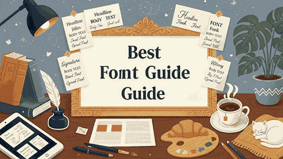
6. Example Best Font Pairing Guide Using Edric Studio
Below are real examples using fonts from Edric Studio. You can feature them as visual mockups inside the article.
🔹 Pairing Example 1
Blacked Font + Aghnesta Font Trio (Sans version)
Perfect for bold modern headings with clean body text.
🔹 Pairing Example 2
Bubble Effect Font + Aghnesta Font Trio (Serif version)
A playful display headline paired with a formal serif body.
🔹 Pairing Example 3
Aghnesta Font Trio Script Style + Sans Style
Use two variations of the same family for effortless visual harmony.
These font pairings demonstrate contrast and harmony while maintaining readability, giving designers an easy model to follow.
7. Common Mistakes in Best Font Pairing Guide
Avoid these errors when creating combinations:
- pairing two very decorative fonts
- using too many typefaces at once
- pairing fonts that fight for attention
- ignoring hierarchy and size contrast
- choosing fonts with conflicting emotional tone
A good rule of thumb: stick to two fonts, or three at most for complex layouts.
8. Best Practices for Consistent Typography
Follow these professional guidelines:
- maintain a consistent scale between headings and body
- keep line height readable for long text
- use consistent kerning and spacing rules
- ensure all fonts support required character sets
- test your pairings on multiple screen sizes
Typography is not only visual—it affects usability and brand clarity. Consistency builds trust and strengthens the message of your design.
9. Final Thoughts
Font pairing is an essential design technique that greatly influences visual communication. By understanding principles like contrast, hierarchy, and harmony, you can confidently combine typefaces that elevate your projects.
Start experimenting with reliable font pairings using Edric Studio professional fonts. Whether you are designing for clients, personal branding, or UI interfaces, choosing the right combination will make your typography more readable and compelling.
Master font pairing today and unlock the full potential of your creative work.
10. References
- Typewolf — Guides & Resources
- Google Fonts — Fonts Knowledge
- Creative Bloq — How to choose the right typeface
- Just the Skills — How to Choose a Font in Simple, Easy Steps