Table of Contents
- Introduction
- Why Pairing Fonts Matters
- Principles of Great Font Pairing (with Research-Backed Tips)
- Top Modern Font Combination Types
- Examples from Edric Studio’s Font Library
- Tips to Make Your Font Combinations Work
- Common Mistakes to Avoid
- Conclusion
- References
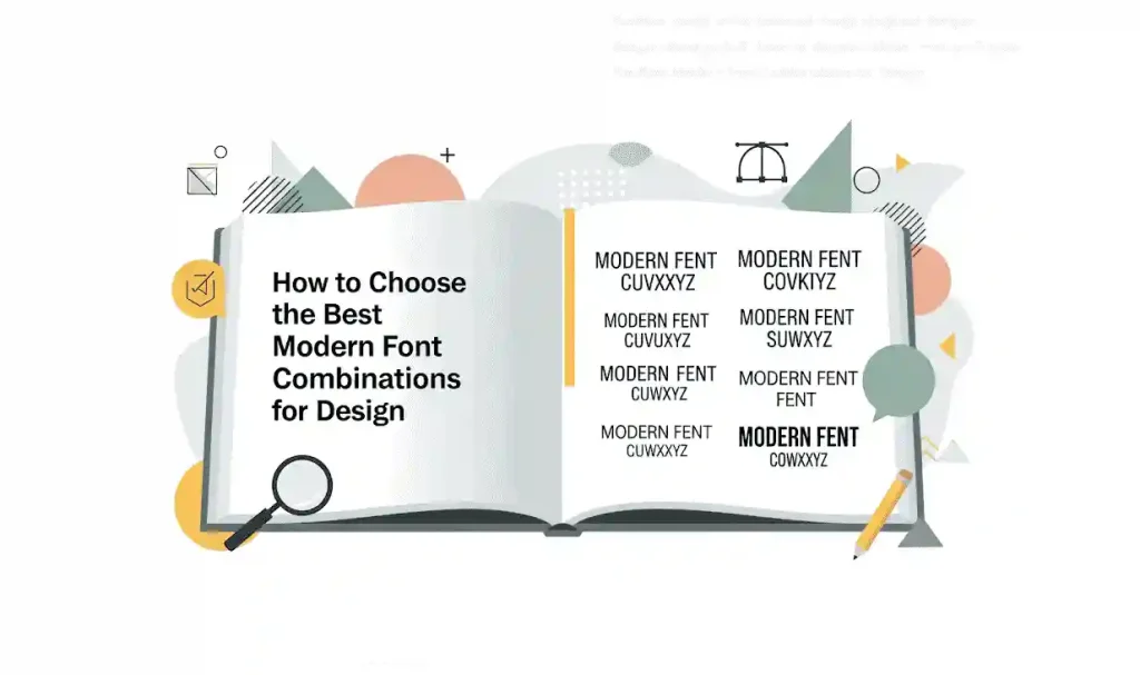
1. Introduction
In the fast-evolving landscape of graphic design, using the right mix of fonts isn’t just about aesthetics — it’s about communicating clarity, mood, and brand consistency. Best modern font combinations for graphic design are combinations that balance legibility, expressiveness, and visual hierarchy. In this guide, we’ll explore what makes font pairings effective, show you types of combinations you can use, demonstrate examples using Edric Studio’s own font library, and reinforce our guidance with references to expert articles and research.
2. Why Pairing Fonts Matters
- Visual hierarchy & readability: Different fonts help draw attention to headings vs body text, making content easier to scan.
- Mood & tone: Fonts carry emotional weight (serif feels traditional, sans serif modern, script personal, etc.). Choosing pairings that align with brand message is crucial.
- Cohesiveness: Good pairings help unify designs — keeping consistency while adding contrast.
- User experience: For digital or print, readability at different sizes, on different backgrounds, is essential.
3. Principles of Great Font Pairing (with Research-Backed Tips)
Here are principles supported by design literature, plus how they help in creating modern font combinations:
| Principle | What Designers / Research Say | How to Apply It |
|---|---|---|
| Contrast | Adobe’s Three Secrets to Font Pairing highlights contrast in width (condensed vs wide) and classification (serif vs sans serif) as a key way to create visual interest. adobe.design | Pair a bold display / decorative font with a clean sans serif or serif. For example, a condensed sans with a wide serif, or different stroke thicknesses. |
| Mixing Serif + Sans-Serif | Adobe article Serif vs Sans Serif: When to Use Which explains that serif fonts often feel more traditional and support readability especially for body copy, while sans serif gives modern clarity and works well on screens. Adobe; also in freeCodeCamp article “How Typography Determines Readability…” which says combining serif & sans serif is effective for good readability and contrast. freecodecamp.org | Use a serif for body text, and sans serif for headings or vice versa. Make sure the styles aren’t too similar so contrast is clear. |
| Use decorative or expressive fonts sparingly | NN/g article The Dos and Don’ts of Pairing Typefaces recommends mixing decorative fonts with neutral ones. Decorative or script typefaces should be reserved for headers or accents, not body text. Nielsen Norman Group | If you have a script or signature style font, use it for logos, headings, or quotes. Pair with a neutral sans serif or serif for the majority of text. |
| Assign distinct typographic roles | Step-by-Step Guide for Pairing Fonts (Learn UI Design) states that choosing a body font first (legible at small size), then adding additional fonts to fill another role (heading, accent) is a sound process. learnui.design | In your design, decide: which font is for headlines, subhead, body text, captions. Use consistent sizes, weights, spacing. |
| Moods & coherence | The Ultimate Font Face-Off: Serif vs Sans Serif in the Psychological Battle of Font Personalities discusses how fonts evoke different emotions and impressions, and that pairings must respect mood coherence. Type Tasting | If your design is modern, minimal, edgy — select fonts that share similar mood attributes (clean lines, minimal contrast). If you mix in a more ornate font, ensure it doesn’t clash visually. |
4. Top Modern Font Combination Types
Here are categories of modern combinations, with suggestions for roles in design:
- Serif + Sans Serif
- Use serif for engagement & tradition (headings or body), sans serif for body or supporting roles.
- Good contrast in stroke, serif detail vs lack of detail.
- Script / Signature + Sans Serif
- Signature or script fonts give personality; pair with clean sans serif for balance.
- Display / Decorative + Simple Sans
- Display fonts deliver impact (posters, logos); the simple font ensures readability.
- Grunge / Textured + Clean Modern Fonts
- Use texture or distress in headline or logo, balanced by smooth, clean fonts in the rest.
- Mono or Superfamilies
- Using fonts from same superfamily (e.g. where serif and sans serif variants exist) gives built-in harmony. Research on superfamilies shows they help maintain style coherence. Eg: Font Superfamily concepts. Wikipedia
5. Examples from Edric Studio’s Font Library
Here are concrete pairings using Edric Studio’s products, chosen to follow the principles above.
| Pairing Scenario | Font Combination | Why It Works / Use Case |
|---|---|---|
| Luxury Branding or Boutique Design | Livingston Font Trio + Monice Sans Serif Font | Livingston gives you serif + script + sans styles — perfect for headings and high-end brand voice. Monice adds clean modern sans serif for supporting text or body copy. Ensures elegance + readability. |
| Bold Display / Posters / Logos | The Champ Sans Serif Fonts + Monice Sans Serif Font | The Champ has heavy weights, decorative styles, gradients or strokes — strongly impactful headline font. Monice is simpler, used for body or secondary text so as not to distract. |
| Edgy / Urban / Alternative Style | Hardenburg Font + clean sans or serif (e.g. Monice) | Hardenburg adds texture, grunge or gothic feel; pairing with Monice or similar keeps the rest legible, prevents over-busy look. |
| Handwritten / Personal Touch Designs | Aghnesta Font Trio + either a serif (from Livingston) or a clean sans | Aghnesta gives character and warmth. Pairing with neutral font for body ensures the design is still professionally readable. |
6. Tips to Make Your Font Combinations Work
- Test at actual sizes: How a font looks in large display vs small caption can differ.
- Adjust line height & letter spacing: Script or decorative fonts often require tighter or looser tracking to avoid crowding.
- Limit number of fonts: Usually 2, at most 3 fonts in one design piece. More is often confusing. (Supported by freeCodeCamp advice) freecodecamp.org
- Define hierarchy early: headlines, subheadings, body copy, captions — assign distinct fonts and styles.
- Keep mood coherence: Make sure all combined fonts feel part of same family in aesthetic spirit (mood, era, style).
- Legibility & accessibility: Enough contrast with background, avoid over-thin strokes for small text. Research shows serif vs sans serif choice, spacing, letter clarity matter. Type Tasting+1
7. Common Mistakes to Avoid
- Using decorative or script fonts for body text → reduces readability.
- Pairing fonts that are too similar (same style, weight) → lack of contrast.
- Mixing fonts with conflicting moods (one ultra modern, one heavily vintage or decorative) without careful balancing.
- Overusing effects (shadows, outlines, gradients) on multiple fonts in same design → visual clutter.
- Ignoring mobile / small-screen display → some display fonts lose character when scaled down.
8. Conclusion
“Best modern font combinations for graphic design” isn’t a fixed formula — it’s guided by contrast, legibility, mood consistency, and thoughtful hierarchy. By following research-backed principles (as in articles by Adobe, NN/g, freeCodeCamp, Canva, etc.), and using quality fonts like those from Edric Studio, your designs can strike both impact and clarity.
If you’re exploring new designs, pick a font for headlines or display first, another for body, maybe a third for accent. Use Edric Studio’s font trios or bold display fonts wisely: Livingston, Aghnesta, The Champ, Monice, Hardenburg. Test at multiple sizes, ensure contrast and readability, keep the design unified in mood. That’s how you land on truly excellent modern font combinations.
9. References
Here are the articles / research sources used to support this guide:
- Adobe — Three Secrets to Font Pairing. Explains using contrast in classification (serif vs sans serif) and width (condensed vs wide). adobe.design
- Adobe — Serif vs Sans Serif: When to Use Which. On the emotional & functional differences between serif and sans serif. Adobe
- freeCodeCamp — How Typography Determines Readability: Serif vs. Sans Serif and How to Combine Fonts. Discusses combining serif + sans serif, mood, readability across different font weights. freecodecamp.org
- Nielsen Norman Group (NN/g) — The Dos and Don’ts of Pairing Typefaces. Advice on mixing decorative and neutral fonts, assigning roles, avoiding overuse. Nielsen Norman Group
- Learn UI Design — The Step-by-Step Guide for Pairing Fonts. Practical process: define brand mood, choose legible body font, add accent fonts, rules of usage. learnui.design
- The Ultimate Font Face-Off: Serif vs Sans Serif in the Psychological Battle of Font Personalities. On psychological impact of font choices. Type Tasting