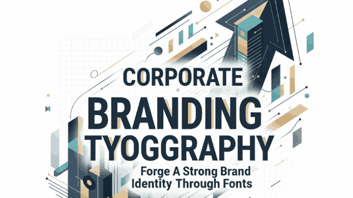
Table of Contents
- Introduction
- What Is Corporate Branding Typography?
- Why Typography Matters in Corporate Branding
- The Psychology of Fonts in Business
- Key Principles for Choosing Corporate Fonts
- Font Pairing and Hierarchy in Branding
- Examples of Effective Corporate Typography from Edric Studio
- Final Thoughts
- References
1. Introduction
Typography is more than just letters on a page — it’s the silent voice of your brand. Every curve, serif, and line communicates something about who you are and what you represent. For businesses, corporate branding typography plays a critical role in shaping public perception, building trust, and ensuring consistent visual communication.
At Edric Studio, we believe the right font can transform how a brand is seen. In this article, you’ll learn what corporate branding typography means, how to select the perfect font for your brand, and how typography can make your business stand out in a competitive marketplace.
2. What Is Corporate Branding Typography?
Corporate branding typography refers to the intentional use of fonts and typefaces to represent a business’s personality, values, and professionalism. It’s a fundamental part of a company’s visual identity — just like logos, colors, and imagery.
Strong corporate typography ensures that your communications — from websites and brochures to presentations and advertisements — look cohesive and reinforce your brand voice.
A well-chosen font system improves readability, recognition, and trust.
3. Why Matters in Corporate Branding Typography
Typography subtly influences how customers perceive your company. Fonts can express emotions such as reliability, innovation, or elegance without saying a single word.
- Trustworthiness: Serif fonts often feel traditional and credible, making them ideal for law firms, finance, or consulting brands.
- Modernity: Sans-serif fonts represent simplicity, innovation, and efficiency, perfect for technology or design companies.
- Creativity: Script and display fonts can add personality and uniqueness when used carefully for creative industries.
Typography helps unify a brand’s message across different media. It gives your audience a sense of familiarity and professionalism — essential qualities for long-term brand loyalty.
4. The Psychology of Fonts in Business
Fonts influence emotions and perceptions. Studies show that typography impacts how people judge a company’s reliability and sophistication. For instance:
- Rounded fonts feel friendly and accessible.
- Sharp-edged fonts signal strength and precision.
- Minimalist sans-serifs give a modern and clean look.
For corporate brands, font psychology is a strategic tool. It ensures that the visual tone aligns with your brand promise and audience expectations.
5. Key Principles for Choosing Corporate Branding Typography
When selecting typography for corporate branding, consider these principles:
a. Consistency
Your fonts should appear uniform across all materials — website, packaging, advertising, and digital assets — to maintain visual coherence.
b. Readability
Corporate fonts should be legible at different sizes and on various devices. Clarity always trumps decoration.
c. Relevance
Match the font’s style to your brand identity. A minimalist tech startup will likely need different fonts than a luxury fashion house.
d. Flexibility
Choose fonts that offer multiple weights and styles for versatile use — headlines, subheadings, and body text.
e. Emotional Connection
Think about what emotion you want your audience to feel when they see your brand — authority, trust, innovation, or warmth.
6. Font Pairing and Hierarchy in Branding
A strong corporate identity often uses two complementary fonts:
- One primary font for logos and headings
- One secondary font for body text
For example, pairing a bold sans-serif for headlines with a clean serif for paragraph text creates visual harmony and distinction.
Typography hierarchy also guides the reader’s attention — the right size, weight, and spacing can make your content more engaging and professional.
7. Examples of Effective Corporate Branding Typography from Edric Studio
At Edric Studio, we craft fonts that combine functionality, style, and brand personality. Here are three examples that demonstrate corporate typography at its best:
- Victorisa 5 Fonts:
A sophisticated font family blending serif and script styles. Its balanced form gives off a premium, trustworthy aura, perfect for luxury or corporate branding. - Curious Track Font:
A bold and modern display font with a professional yet dynamic energy. Ideal for innovative and creative businesses aiming for strong visual impact. - TerryBruce Sans Serif Fonts:
Clean, modern, and geometric — this sans serif typeface projects clarity, confidence, and reliability, suitable for startups, agencies, and corporate institutions.
Each of these fonts demonstrates how typography shapes brand perception through subtle design cues and emotional tone.
8. Final Thoughts
Corporate branding typography is not just about picking a “nice-looking” font. It’s about finding the right visual language for your brand — one that conveys your values, mission, and credibility.
When done well, typography elevates your brand from ordinary to memorable, fostering recognition and trust among your audience.
At Edric Studio, we design typefaces that embody brand identity and emotional depth. Whether you need fonts for bold headlines, professional documents, or modern digital branding, our collection helps you speak your brand’s language through design.
Explore more fonts at Edric Studio and discover how the right typography can define your business identity.
9. References
- 99designs — The fundamentals of font psychology
- Visme — The Ultimate Guide to Font Psychology
- Justtheskills — 7 Tips to Select the Right Brand Fonts for Business