Table of Contents
- Introduction
- Why typography matters in e-commerce
- Trend #1: Readability + brand personality
- Trend #2: Bold headlines & immersive display type
- Trend #3: Responsive & variable fonts for all devices
- Trend #4: Custom brand typefaces & unique identity
- Trend #5: Pairing fonts strategically for e-commerce
- Applying the trends: real-world mockups & your font library
- Best practices & pitfalls to avoid
- Conclusion
- References
1. Introduction
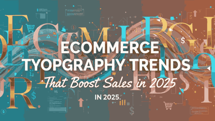
Ecommerce Typography Trends In the world of online retail, your typography isn’t just about aesthetics—it plays a central role in user experience, brand trust, readability, and ultimately conversion. As more and more commerce shifts online, shoppers not only evaluate product images and descriptions—but also how the content is presented. This article dives into the key Ecommerce Typography Trends designers, foundries and online-store operators should pay attention to in order to stay modern, readable and effective.

2. Why typography matters in Ecommerce Typography Trends
Typography in the e-commerce context serves multiple roles:
- It influences readability of product descriptions, menus, calls-to-action.
- It communicates brand personality (luxury vs budget; playful vs serious).
- It affects user perception of trust and quality. Research shows that typography significantly influences user perception and interaction within e-commerce platforms.
- It supports conversion – an easily readable typeface with appropriate hierarchy can reduce friction, increase engagement and drive purchases. For instance, one guide emphasizes that choosing the “right font style for your eCommerce store” can impact cart abandonment and conversions.
Because of all this, as a font foundry and shop, you have a prime opportunity: design fonts that are not just beautiful, but built for e-commerce success.
3. Ecommerce Typography Trends #1: Readability + brand personality
The baseline for any e-commerce font is readability — especially on mobile, smaller screens, different browsers, differing internet speeds. Many sources point out that sans-serif fonts (clean, modern) remain popular for body text and product descriptions.
At the same time, brands are also using typography to infuse personality. As one “20 Stunning Examples of Typography in E-commerce” article puts it: “E-commerce sites demand fonts that are both readable and reflect a brand’s identity.”
What this means for your fonts:
- Ensure your font families have good x-height, open counters, good legibility in smaller sizes.
- Offer varying weights (regular, bold) and styles (italic, condensed) so the store operator can differentiate headings vs body vs labels.
- For body copy choose clean sans serifs; but for brand headings you might lean into a more character-rich version (perhaps a slightly stylised sans, a modern serif, or subtle decorative elements) that still reads well.
4. Ecommerce Typography Trends #2: Bold headlines & immersive display type
As scrolling and mobile shopping become dominant, typography for e-commerce is moving beyond supporting copy—it becomes part of the visual experience. Big, bold headlines, oversized typography, dramatic display fonts are clues to this trend. According to one web-design typography trends article: “In 2024, trends like bold typography, … creative serif fonts are helping brands make stronger visual statements.”
How to leverage this:
- Use display fonts for hero sections, product category banners, promotional pop-ups.
- Create fonts with heavy weights, dramatic contrast, or distinct styles that capture attention.
- But maintain consistency: a bold headline font must still pair well with body text and not degrade usability.
For example, within your foundry product line you might highlight display-oriented families like: - Myron Hector Sans Serif Font – for strong modern brand headings.
- Stanwick Fonts Duo – providing contrast between headline & sub-text.
These align with this headline-centric trend while remaining e-commerce functional.
5. Ecommerce Typography Trends #3: Responsive & variable fonts for all devices
With e-commerce being accessed from desktops, tablets, smartphones, kiosks—and even watches—the typography needs to adapt. Variable fonts, optical size axes, width axes are gaining traction. A 2025 typography-trends overview lists “Custom & Variable Fonts” and “Oversized and Bold Fonts” among key shifts.
For your font foundry and store clients:
- Consider offering variable-font versions of your families (single file, multiple weights/widths) to reduce load times and improve consistency.
- Make sure fonts perform well across devices: test on mobile, low-resolution screens, and ensure web-performance best practices (like font-display: swap and sub-setting).
- Emphasize that your fonts are “future-proof” and built for responsive commerce experiences.

6. Ecommerce Typography Trends #4: Custom brand typefaces & unique identity
In a crowded online store market, brands are striving for differentiation. One way is using a unique or custom typeface rather than a generic off-the-shelf font. The trend toward custom fonts and brand-specific typography is documented in broader typography trend analysis.
What this opens up for you:
- Offer bespoke or semi-custom design services: adapt an existing family to a brand’s needs, or design a completely custom font for a key client.
- Market your fonts not only as “styles” but as brand assets—fonts that can become part of a brand’s visual identity, supporting everything from product pages to packaging.
- Show case-studies on your site of how a font can elevate a brand’s e-commerce presence, reinforcing trust and recognition.
7. Ecommerce Typography Trends #5: Pairing fonts strategically
Selecting just one font is rarely enough in e-commerce. You need hierarchical systems: headings, body text, sub-text, buttons, labels. Many sources emphasise using font pairings: “Successful e-commerce websites opt for a pair of typefaces — one for headlines, and another for body text.”
What this implies for your library:
- Offer families that pair well together (same visual DNA; complementary weights).
- Provide clear marketing materials: show best-practice pairings, usage examples. For instance:
- You Beautiful Font – perhaps for headline / brand logo use.
- Kala Nirmala Font – for body text and descriptions.
- Educate clients/stores: for example, pairing a display font for category headings with a clean sans for product details.
- Ensure the combinations maintain readability, performance, accessibility (contrast, size, spacing).
8. Applying the trends: real-world mockups & your font library
Here’s how you can turn these trends into actionable steps within your font business:
- Create mockups: Use your fonts in e-commerce scenarios—product listings, hero banners, mobile checkout screens. Show how they respond across devices.
- Highlight features: For each font, mention: suitable use-cases (headings, body, labels), available weights/styles, variable font support, performance optimisation.
- Bundle best-practice guidance: Provide a short “how to use” for each font or pairing (e.g., “Use this for hero heading, pair with this family for body copy. For mobile reduce size to X px”).
- Promote trend alignment: Emphasize “designed for the latest e-commerce typography trends” in your marketing copy, showing you’re not just creating fonts—but creating fonts built for conversion, readability and brand identity.
- Use your own font examples: As noted earlier, link clearly to your available fonts so readers can explore:
9. Best practices & pitfalls to avoid
Best practices:
- Keep typography consistent across pages. Establish a clear hierarchy of headings, sub-headings, body text.
- Prioritise performance: use web-optimised font formats (WOFF2), sub-subset where possible, implement font-display: swap to avoid invisible text.
- Ensure accessibility: contrasts, legibility, testing on mobile and older devices.
- Provide licensing and usage clarity: e-commerce clients appreciate straightforward rights and usage for web, packaging, global markets.
Pitfalls to avoid:
- Using too many unique fonts in one store (this can confuse branding and hurt performance).
- Choosing a display font for body copy—this may hamper readability and conversions.
- Ignoring mobile devices: fonts that look great on desktop but shrink or blur on mobile will harm UX.
- Neglecting updates: outdated or unsupported fonts may lack modern features (variable axes, web-optimised hinting) and fall behind trend or performance requirements.
10. Conclusion
In the dynamic landscape of Ecommerce Typography Trends goes far beyond “just choosing a font.” It’s about readability, brand identity, performance, responsiveness—and ultimately conversion. For a foundry like EdricStudio, this means designing fonts that meet all these criteria, marketing them as “built for e-commerce”, and educating your clients on how to implement them effectively.
By aligning your font collections with key trends—readability + personality; bold display; responsive & variable fonts; custom brand typefaces; strategic pairings—you’ll not only make fonts that look good, but fonts that work hard. And when e-commerce retailers see that your fonts support their business goals (UX, readability, brand differentiation, conversion), you make your foundry an indispensable resource.
Go ahead and refresh your font releases, update your showcase with trend-driven mockups, highlight how your fonts solve e-commerce specific needs—and watch as your fonts become go-to choices for online stores worldwide.
11. References
- Creative Market – “20 Stunning Examples of Typography in E-commerce”.
- Figma – “24 Best Fonts for Websites in 2025”.
- Fast Simon – “Best Font Styles for Your E-commerce Store”.
- Unified Infotech – “Top Typography Trends in Web Design for 2025”.