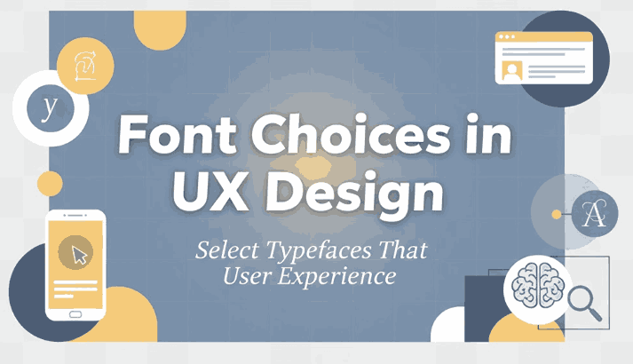
Table of Contents
- Why Font Choices Matter in UX Design
- Core Principles for Font Choice in UX
- Practical Workflow: How to Choose Fonts for UX Design
- Example Fonts from EdricStudio for UX-Friendly Design
- Common Mistakes & How to Avoid Them in UX Font Choice
- Conclusion
- References
1. Why Matter Font Choices UX Design
In Font Choices UX Design, typography is more than aesthetics — the fonts you choose directly impact readability, accessibility, hierarchy, and ultimately how users perceive and interact with your interface. According to design analysis, “fonts affect user experience by influencing readability, navigation, and engagement.”
Another UX guide points out:
“Choose typefaces that fit your design … Stick to one or two fonts to keep it consistent.”
When you and your team at EdricStudio design and sell fonts, understanding UX implications means you can help clients choose fonts that truly support digital product experiences—not just look good on a poster.
2. Core Principles for Font Choices UX Design
Here are key principles when considering font choices in UX design:
a) Readability & Legibility
Fonts used in UI must emphasise clarity. For body text or interface instructions you want forms, buttons, labels to be instantly understandable. The UXDT guidelines list using “fonts with clear shapes, avoiding overly decorative styles.”
b) Visual Hierarchy & Contrast
Fonts should help users scan and absorb information quickly via clear heading vs body differentiation, weight, size and spacing.
c) Consistency & Branding
Your typeface choices should be aligned across screens, devices and interface states — helping maintain brand identity and UX familiarity.
d) Accessibility & Performance
In digital products, font choice must support accessibility (contrast, sizing, scaling) and performance (file size, web-safe, loading).
e) Context & Medium
UX environments differ: mobile, tablet, desktop, small screens, large screens. Fonts must scale, adjust spacing, line height and letter spacing accordingly.
3. Practical Workflow: How to Font Choices UX Design
Here’s a step-by-step guide you and your clients can follow:
- Define the User & Device Context
Determine whether your interface is mobile, desktop, web app, embedded device. What size, resolution and interaction mode will the user face? - Shortlist Candidate Fonts
Pick fonts that align with brand personality and meet UX requirements (clear shapes, appropriate weight, adequate spacing). - Test at UI Sizes & States
Preview fonts at typical UI sizes: e.g., 14-16px body text in mobile, 20-24px headings, button labels at 12-14px. Use real interface states (hover, disabled, error, small screen). - Check Hierarchy & Spacing
Ensure heading levels, sub-headings, labels and body text are clearly distinct via size/weight/spacing. Use line height ~1.4-1.6 for body text per UX guidelines. - Run Accessibility & Contrast Checks
Make sure your font performs in light/dark modes, sufficient contrast (e.g., WCAG 4.5:1), and legible at smaller sizes. - Performance & Loading Considerations
If used on web/app: ensure the font file is optimized, web-safe formats, minimal weights to reduce load time and support smooth UI. - Document / Build Style Guide
Once font choice is finalized, define roles (Heading1, Heading2, Body, Caption), paired fonts if used, size scales, spacing and usage rules.
By following these steps, you help ensure that font choices in UX design are strategic, not accidental.
4. Example Fonts from EdricStudio for UX-Friendly Design
Here are four example fonts from your collection that could be used effectively in UX design contexts:
- Liburan Font – Great for headings or branding elements in interfaces; be sure to test at smaller sizes or alternate weights for body text.
- Amorica Font Quartet – A family that may offer multiple styles/weights—use heavier styles for headings, lighter for body or sub-text in UI.
- Northcliff Serif Fonts– Serif fonts can still work in UI if carefully used (for headings or statement text), but for body UI text consider pairing with a sans service for clarity.
- Oppy Sahra Hand Lettering Font – Use this stylish script/hand-lettering font sparingly (e.g., decorative labels, splash screens) rather than body or interactive text, to maintain UX clarity.
By presenting these fonts in context of “font choices in UX design”, you highlight how your foundry supports both style and usability for digital products.
5. Common Mistakes & How to Avoid Them in Font Choices UX Design
Here are pit-falls often seen in UX font selection—and how to steer clear:
- Mistake: Using too many fonts or font families
Switching between many typefaces can confuse users and increase load time. Best practice: 2-3 typefaces max. - Mistake: Choosing display decorative fonts for body or interactive text
Over-stylised fonts may look good but become unreadable at small sizes or in interface states. Use decorative fonts sparingly. - Mistake: Ignoring spacing/line height/letter spacing for UI
Tight line heights or letter spacing can make mobile or small screen text cramped. Use recommended line heights (~1.4-1.6) and adequate spacing. - Mistake: Neglecting accessibility and performance
Poor contrast, non-scalable fonts or heavy font files degrade UX. Make sure font choice aligns with accessibility guidelines and loading performance. - Mistake: Font choice not aligned with brand or context
A font may look trendy but if it doesn’t match brand tone or user expectations (e.g., serious vs playful), it undermines UX trust.
Being aware of these common issues helps you guide your clients to make smarter font choices in UX design.
6. Conclusion
Font choices in UX design matter significantly: they affect readability, usability, brand perception, accessibility and product performance. By thinking strategically about font roles, context, spacing, hierarchy and device responsiveness, designers and brands can create interfaces that not only look good but work well.
At EdricStudio, by designing fonts and educating your audience about thoughtful font choice for UX, you position yourself as more than a font vendor—you become a partner in digital experience quality.
When you choose fonts that serve both style and usability, you set your products, apps and interfaces up for success in the real world.
7. References
- Medium – The UX Designer’s Guide to Typography.
- Enxyclo – “Font Choices in UX Design: How to Improve User Experience”.
- UXDT – “Typography – UI/UX Guidelines”.
- UX Planet – “Principles of Typography in UI Design”.
- DeveloperUX – “Typography in UX: Best Practices Guide”.