Typography is not only about style. Instead, it also shapes how users experience your website. In this guide, you will learn how to choose typography for web design. The right font improves readability and strengthens your brand. Moreover, it builds trust and keeps visitors engaged. Applying these principles makes your website look professional and user-friendly.
Why Typography for Web Design Matters
Typography is more than pretty letters. It changes how people read your content and how they feel about your brand. Good typography improves readability, guides visitors through your site, and therefore increases their trust.
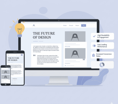
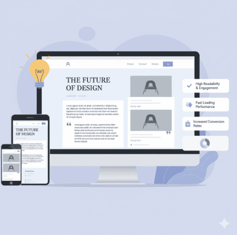
Websites with strong typography keep users longer. As a result, they also see more conversions. Choosing fonts is not just about design. Rather, it is about communication and results. Strong typography also makes your brand look more reliable.
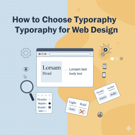
Key Principles: How to Choose Typography for Web Design
1. Readability Comes First
Your first goal should always be clarity. Fonts must be easy to read on screens. For example, sans-serif styles such as Modern Elegant Sans Serif work well. However, avoid decorative fonts in long paragraphs.
2. Limit the Number of Fonts
Too many fonts create visual noise. Consequently, the design feels unprofessional and confusing. A simple rule is to use two or three fonts: one for headings, one for body text, and one accent font if needed.
3. Match Fonts to Brand Identity
Fonts tell your brand story. For instance, a clean sans-serif looks modern and professional. In contrast, a handwritten script shows creativity. If you want more personality, try our Handwritten Script Collection.
4. Check Contrast and Accessibility
Always check the contrast between text and background. Good contrast makes reading easier and improves accessibility. Adjust font size and spacing so the content is easy to scan. Because of this, accessible typography builds trust and helps SEO.
5. Consider Performance
Fonts affect loading speed. In fact, large font files slow websites down. Therefore, use optimized web fonts and limit styles. As a result, a faster site keeps visitors engaged and reduces bounce rates.
Common Typography for Web Design Mistakes to Avoid
Even if you know how to choose typography for web design, mistakes still happen. Nevertheless, you can avoid them.
- Using too many decorative fonts.
- Picking fonts that do not match the brand identity.
- Ignoring readability on mobile devices.
- Forgetting accessibility guidelines.
By avoiding these mistakes, your site will look more professional. In addition, you give users a better experience.
Fun Fact About Typography for Web Design
Did you know that 97% of web users judge a site’s credibility by its design? Typography is one of the first things they see. The right font can be the difference between a bounce and a loyal visitor. Strong typography builds trust before people even read your words.
Final Takeaway on Typography for Web Design
Typography shapes how users see and trust your brand. By learning how to choose typography for web design, you will build a site that is readable, memorable, and reliable.
If you want fonts that combine design quality and web performance, explore our collections:
These options give you professional results while keeping your site fast and accessible. Above all, they help your brand stand out in a competitive market.
References: