Table of Contents
- Introduction
- Why Typography Matters in Poster Design
- Poster Typography Tips Every Designer Should Know
- 3.1 Choose Fonts with High Readability
- 3.2 Use Font Pairing Strategically
- 3.3 Establish a Clear Text Hierarchy
- 3.4 Pay Attention to Spacing and Alignment
- 3.5 Consider Mood, Tone, and Visual Intent
- Best EdricStudio Fonts for Poster Typography
- Common Mistakes to Avoid in Poster Typography
- Final Thoughts
- References
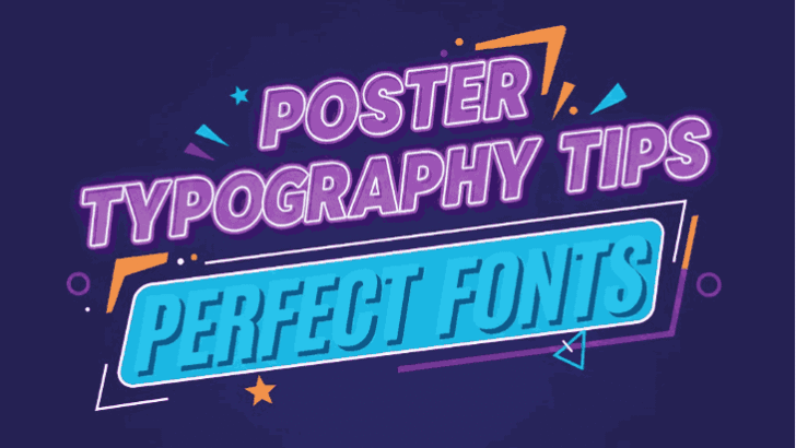
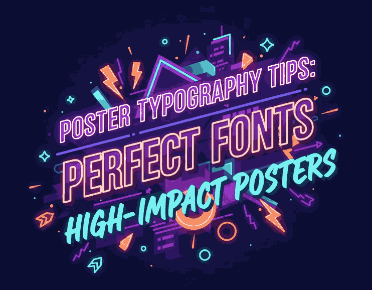
1. Introduction Poster Typography Tips
Poster Typography Tips design has always been a timeless way to share messages—whether for events, promotions, branding, or artistic showcases. But behind every great poster is great typography. The right font can grab attention instantly, while the wrong one can make your poster look dull, confusing, or entirely ineffective.
This article explores actionable Poster Typography Tips to help designers make impactful visual decisions. If you’re creating posters for advertising, social media, print, or branding, these typography insights will elevate your designs.
2. Why Typography Matters in Poster Typography Tips
Typography is more than choosing fonts—it’s a communication tool that influences how your audience reads, interprets, and emotionally responds to your message.
Great poster typography:
- Captures attention in the first few seconds
- Communicates mood, message, and brand personality
- Enhances readability from a distance
- Guides viewers’ eyes smoothly across the layout
- Helps highlight important information
In short, powerful typography turns a simple poster into a visually striking and memorable experience.
3. Poster Typography Tips Every Designer Should Know
3.1 Choose Fonts with High Readability
Posters are often viewed from a distance, so clarity is essential. Choose fonts that maintain strong readability even at large sizes.
Sans-serif fonts usually work well:
- Clean structure
- Bold and modern
- Highly legible both digitally and in print
Readable fonts ensure your message is noticed, not ignored.
3.2 Use Font Pairing Strategically
Smart pairing creates visual contrast and hierarchy. Some popular pairings include:
- Bold sans-serif + thin sans-serif
- Sans-serif for headlines + serif for body text
- Futuristic font for main title + clean sans-serif for supporting text
Always avoid using too many fonts; stick to 2–3 maximum for a balanced design.
3.3 Establish a Clear Text Hierarchy
A poster should guide the viewer’s eyes naturally. Text hierarchy helps define what’s important:
- Headline → grabs attention
- Subheadline → provides context
- Body text → delivers details
You can adjust hierarchy using:
- Size
- Weight
- Color
- Spacing
A strong hierarchy also helps reduce visual clutter.
3.4 Pay Attention to Spacing and Alignment
Even the best fonts can look unprofessional without proper spacing.
- Kerning adjusts spacing between characters
- Leading controls spacing between lines
- Tracking modifies overall letter spacing
Align your text using grids or visual anchors to ensure consistency. Proper spacing creates harmony and improves readability.
3.5 Consider Mood, Tone, and Visual Intent
Typography expresses emotion.
Ask yourself:
- Is the poster modern or classic?
- Loud or minimalistic?
- Professional or playful?
- Futuristic or elegant?
Fonts have personality—choose one that matches your message.
4. Best EdricStudio Fonts for Poster Typography Tips
Here are highly recommended fonts from EdricStudio that are perfect for poster design:
1. Nothan Futuristic Font
Ideal for tech events, sci-fi posters, gaming promotions, and bold modern concepts. Its futuristic strokes deliver a powerful and standout headline style.
2. Roundfra Sans Serif Font
A clean, simple, geometric sans-serif perfect for minimalist, modern, and corporate posters. It provides excellent readability and professional aesthetics.
3. Calderdale Sans Serif Font
A refined and stylish sans-serif that works beautifully for fashion, branding, editorial, and luxury poster design. Perfect for elegant typography arrangements.
These three fonts offer versatility and high visual impact—important qualities in poster typography.
5. Common Mistakes to Avoid in Poster Typography Tips
Even experienced designers sometimes fall into these traps:
❌ Using too many fonts
→ This creates confusion and makes the design look unprofessional.
❌ Poor color contrast
→ Low contrast reduces readability, especially from a distance.
❌ Overly decorative fonts for body text
→ Use display fonts only for headlines.
❌ Ignoring alignment
→ Misalignment disrupts visual flow and hierarchy.
❌ Forcing too much text
→ Posters must communicate fast. Keep it readable and simple.
Avoiding these mistakes ensures your poster typography looks polished and effective.
6. Final Thoughts Poster Typography Tips
Typography is the backbone of every successful poster design. By choosing readable fonts, maintaining hierarchy, using proper spacing, and selecting typefaces that match your message, you create posters that not only look visually stunning but also communicate clearly.
With fonts like Nothan Futuristic, Roundfra Sans Serif, and Calderdale Sans Serif from EdricStudio, you’ll have powerful tools to elevate your poster designs to a professional and memorable level.
If you’re looking to enhance your poster design workflow, always begin with the right typography.
7. References Poster Typography Tips
- Canva — How to Choose Fonts for Your Design
- AIGA — The Role of Typography in Visual Communication
- Just The Skills — A Complete Basic Font and Typography Guide for Poster Design