
Table of Contents
- What Are Responsive Web Typography Fonts?
- Why Responsive Typography Matters for Websites
- Best Practices for Responsive Web Typography
- Font Examples from Edric Studio: Ready for Responsive Use
- Technical & Performance Considerations
- Conclusion
- References
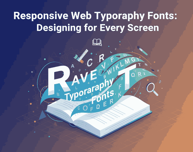
1. What Are Responsive Web Typography Fonts?
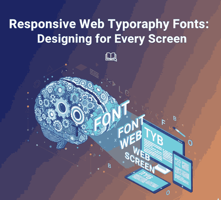
Responsive Web Typography Fonts refers to the practice of designing and implementing fonts (typefaces) that adapt gracefully across varying screen sizes, devices, and contexts—ensuring they remain readable, legible and visually aesthetic whether on a small smartphone screen or a large desktop monitor. The term “Responsive Web Typography Fonts” captures not only the typefaces themselves but also their behaviour in fluid layouts.
As one expert source notes:
“Responsive Web Typography Fonts is a tough nut to crack … use relative units, vertical rhythms and meaningful typography scales.”
Another resource highlights that typography on the web must adapt to the user’s device and network, not just static print conditions.
In the context of your foundry at Edric Studio, offering fonts that work well in responsive settings adds considerable value: your customers need fonts that perform aesthetically and functionally across screen sizes and devices.
2. Why Responsive Web Typography Fonts Matters
Here are several reasons why responsive typography fonts deserve the attention of designers and brands:
A. Readability & User Experience
When a font doesn’t scale well or lacks adaptability, reading becomes cumbersome on mobile devices. One article emphasises that typography should be clear and easy to read across devices and screen sizes. Good responsive typography enhances comfort, reduces strain and supports longer engagement.
B. Consistent Brand Identity Across Devices
Brands increasingly operate in a multi-device world. Whether someone visits from a smartphone, tablet or desktop, typography needs to maintain the brand’s voice. A font that fails in smaller screens damages perceived quality.
C. Performance & Accessibility
On the web, fonts impact performance (load times) and accessibility (readers with different needs). Responsive typography addresses these by using scalable units, fluid sizing, and optimized font formats. The resource from web.dev emphasises font-loading strategies, variable fonts and the impact of responsive fonts on user experience.
D. Visual Hierarchy & Layout Control
Responsive typography ensures headings, body text, captions and UI elements maintain consistent relationships across breakpoints. This supports clear hierarchy, regardless of device size, which is essential for readability and design coherence.
3. Best Practices for Responsive Web Typography Fonts
Here are actionable guidelines you and your customers can apply when working with responsive web typography fonts:
3.1 Define TYPOGRAPHIC SCALE and Breakpoints
Establish a typographic scale (for heading levels, body text) and adjust at different screen sizes. The “Everything I Know” article explains this via modular scales and breakpoints.
Example: Increase base font size at larger viewport widths so the reading distance (desktop) is considered.
3.2 Manage Line Length, Line-Height & Spacing
Line length (characters per line) impacts readability more than many designers expect. Cieden notes you should aim for around 75-80 characters per line max. Adjust line-height, letter-spacing and margins accordingly across devices.
3.3 Choose Typefaces That Are Legible at Different Sizes
When selecting fonts (or offering them), ensure they perform well at small sizes (mobile) and large (desktop). Screen-friendly sans-serifs or well-constructed serifs matter. ThoughtLab’s article emphasises legibility and readability as primary for web typography.
3.4 Font Formats & Loading Strategies
Use modern web-font formats like woff2, woff, and adopt font-display: swap or similar strategies to prevent invisible text during font load. Web.dev highlights variable fonts and performance optimization for web typography.
3.5 Test Across Devices & Contexts
Always preview fonts on multiple viewport sizes and contexts (light/dark mode, mobile/desktop). Even excellent fonts may behave differently in narrower screens or different fonts sizes. Use device emulators and real devices.
4. Font Examples from Edric Studio: Ready for Responsive Web Typography Fonts Use
Here are four fonts from Edric Studio that are well-suited for responsive web typography usage—ideal for design systems that adapt across devices.
- Battlesbridge Font – With strong character and clean structure, it makes a compelling headline font. Its clarity at larger sizes means when scaled down for mobile headings it retains strength.
- Explore Sky Font Duo Family – A font duo offers both a primary and complementary font (for example for headings and body). Useful in responsive systems where you need variants.
- Victorisa 5 Fonts – A family with multiple weights helps create typographic hierarchy (e.g., headings, sub-headings, body) within responsive layouts.
- NairiAmber Font Duo– A font duo designed for flexible use—suitable for digital headings and body text across screen sizes.
By featuring these fonts in your article, you not only illustrate responsive typography in action but also drive readers to explore your offerings.
5. Technical & Performance Considerations Responsive Web Typography Fonts
When implementing responsive web typography fonts, keep performance and technical constraints in mind:
A. Font File Size & Formats
Large font file sizes slow down page load, especially on mobile networks. Studies show that format choice (e.g., woff2 vs ttf) impacts performance significantly.
Offering optimized web fonts (sub-set, variable fonts) in your catalogue can be a selling point.
B. Font Loading Strategies
Use @font-face with font-display: swap to ensure fallback fonts show quickly and avoid blank text. Web.dev explains how font-loading behaviour affects user experience.
C. Browser & Device Support
Different browsers and devices interpret CSS units, media queries and font rendering differently. Always test across major browsers and consider fallback fonts and web-safe stacks.
D. Accessibility & Contrast
Responsive typography also implies accessibility: font size must respond to user preferences, and contrast must remain sufficient across devices. ThoughtLab emphasizes this in web typography best practices.
E. Maintenance & Scalability
When you offer fonts for responsive use, consider providing a style guide or usage notes for scaling, pairings, and web-font performance. This increases the value of your product.
6. Conclusion Responsive Web Typography Fonts
Responsive web typography fonts are no longer optional—they are essential in an era of multi-device browsing. A design that fails to adapt its typography across screen sizes risks being unreadable, inconsistent or visually broken.
At Edric Studio, your typography library becomes more powerful when paired with responsive use-cases. By choosing and promoting fonts like Battlesbridge, Explore Sky, Victorisa and NairiAmber—designed with adaptable form and flexible weights—you provide designers with not only fonts, but solutions for modern responsive systems.
Remember: use relative units, establish scalable typography, manage spacing and performance, test across devices—and always keep readability and brand voice front and centre. When done right, responsive typography supports both function and aesthetics, delivering an optimal reading experience at any screen size.
7. References Responsive Web Typography Fonts
- Williams Media – 10 Essential Responsive Typography Tips For Better Web.
- Cieden – What is responsive typography and how to implement it in web designs.
- Zell Liew – Everything I know about Responsive Web Typography.
- Web.dev – Typography – Responsive typography and web font performance.
- ThoughtLab – The Role of Typography in Web Design: Best Practices and Tips.