Table of Contents
- Introduction
- What Are Serif Fonts?
- What Are Sans Serif Fonts?
- Key Differences Between Serif and Sans Serif Fonts
- When to Use Serif Fonts
- When to Use Sans Serif Fonts
- Serif vs Sans Serif in Digital Interfaces
- Choosing the Right Font for Branding
- Best Serif and Sans Serif Fonts from Edric Studio
- Conclusion
1. Introduction
Fonts are more than just letters on a screen—they are powerful design tools that shape perception, readability, and brand identity. Among all the font categories, serif vs sans serif fonts are the most common debate in design. Choosing the right one can make your project more professional, trustworthy, and appealing to your audience.
In this article, we’ll break down the key differences between serif and sans serif fonts, when to use each, and how they impact your branding and digital design.
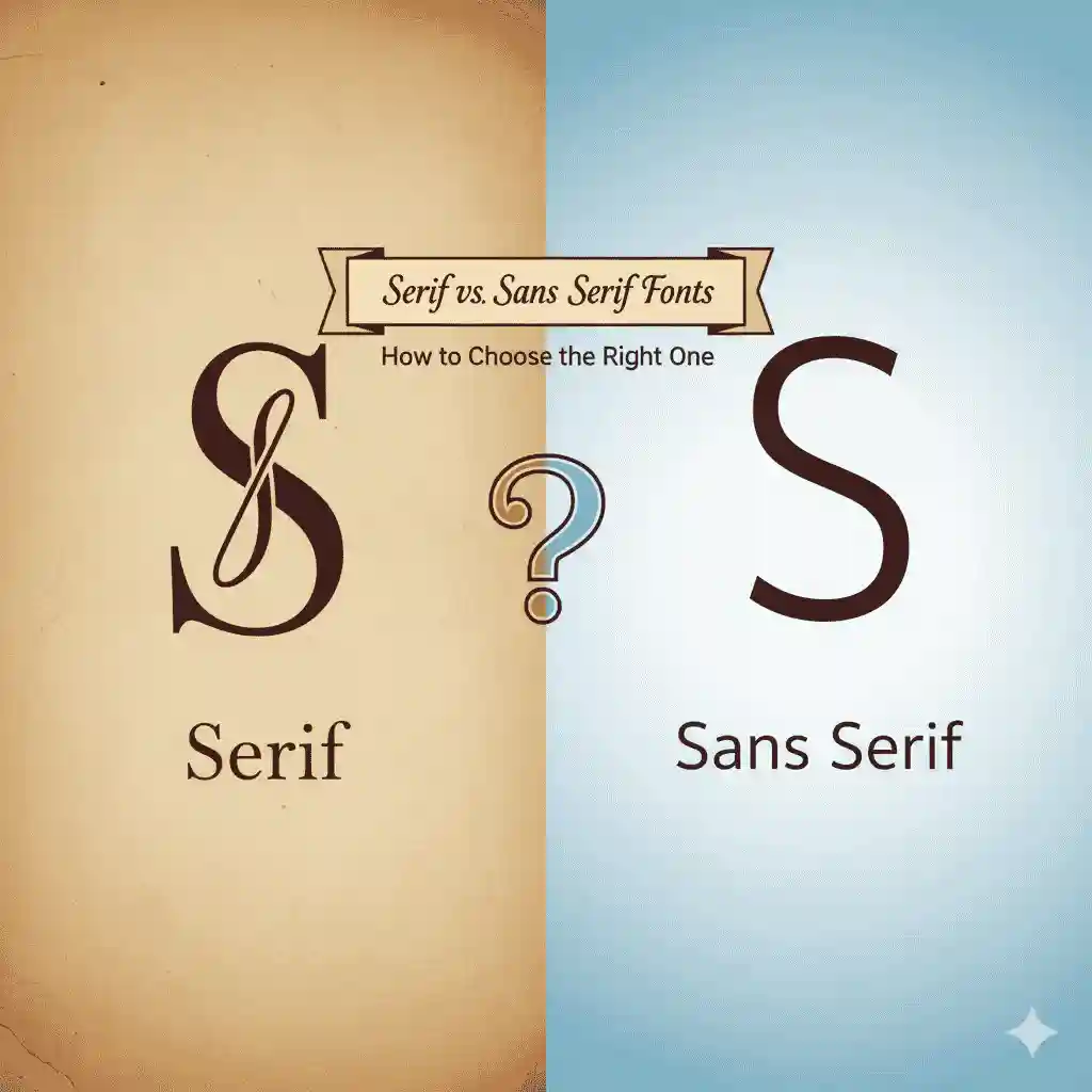
2. What Are Serif Fonts?
Serif fonts are typefaces that have small decorative strokes or “feet” at the ends of their letters. These fonts have a long history in print, dating back to Roman inscriptions.
Examples of popular serif fonts: Times New Roman, Georgia, Garamond.
They are often associated with tradition, authority, and professionalism, making them a favorite in editorial, publishing, and luxury branding.
👉 Looking for modern serif fonts for your next design project? Check out our collection at Edric Studio Serif Fonts.
3. What Are Sans Serif Fonts?
Sans serif fonts, as the name suggests, are fonts without decorative strokes. The term comes from the French word “sans,” meaning “without.” These fonts are typically clean, simple, and modern.
Examples of popular sans serif fonts: Helvetica, Arial, Open Sans.
They are widely used in digital platforms because they provide clarity and legibility on screens.
👉 Explore sleek and modern Sans Serif Fonts from Edric Studio.
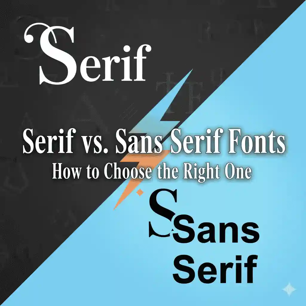
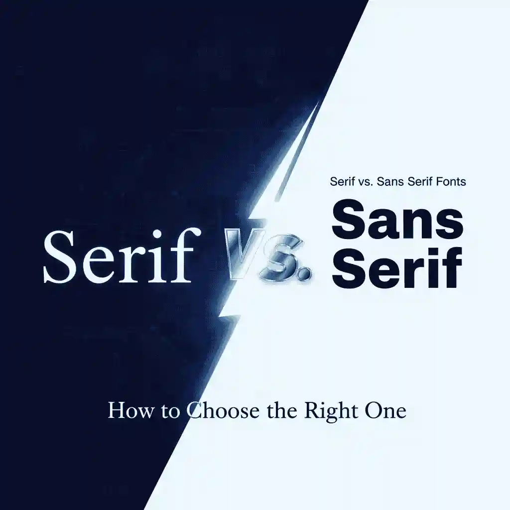
4. Key Differences Between Serif and Sans Serif Fonts
Here are the main distinctions:
- Appearance: Serif fonts have decorative strokes; sans serif fonts are clean and minimal.
- Perception: Serif conveys tradition and authority; sans serif communicates modernity and simplicity.
- Readability: Serif is often considered easier to read in print; sans serif excels on screens.
- Usage: Serif is common in books, newspapers, and logos; sans serif dominates websites, apps, and digital marketing.
5. When to Use Serif Fonts
Serif fonts are best suited for:
- Print media like books, magazines, and newspapers.
- Luxury brands to add elegance and sophistication.
- Formal documents like certificates, resumes, or academic reports.
Try fonts like our Elegant Serif Typeface collection to achieve a timeless look.
6. When to Use Sans Serif Fonts
Sans serif fonts shine in:
- Websites and apps where readability on screens is essential.
- Tech companies and startups to showcase innovation.
- Modern branding with a minimalist vibe.
Check out our Modern Sans Serif Fonts that fit digital-first design needs.
7. Serif vs Sans Serif in Digital Interfaces
In UI/UX design, readability is the top priority. Sans serif fonts are often preferred for body text on websites and mobile apps because they scale well across devices.
However, many designers still use serif fonts for headlines or branding elements to give contrast and hierarchy.
📖 For more insights, check this resource: Adobe’s guide to choosing fonts.
8. Choosing the Right Font for Branding
Your font choice reflects your brand personality:
- Serif = Trustworthy, classic, elegant
- Sans Serif = Modern, approachable, clean
The best approach is to combine both. For example, use a serif font for headings and a sans serif for body text. This balance creates contrast while keeping readability intact.
9. Best Serif and Sans Serif Fonts from Edric Studio
At Edric Studio, we design and sell professional fonts tailored for branding, packaging, social media, and digital use. Here are some recommendations:
- Royalty Serif Font – perfect for luxury branding.
- Urban Sans Font – a modern sans serif for digital projects.
- Elegant Modern Serif Typeface – ideal for magazines and high-end design.
- Minimal Sans Typeface – clean and versatile for websites.
10. Conclusion
The serif vs sans serif fonts debate is not about which is better, but which fits your design needs. Serif fonts add tradition and authority, while sans serif fonts bring clarity and modernity. The best designers know when to use each—or combine both—to create impactful visuals.
If you’re looking for high-quality serif and sans serif fonts, explore our collection at Edric Studio.