Typography Tips for Better Website Readability A Complete Guide

Typography Tips for Better Website Readability: A Complete Guide

Table of Contents 1. Why Typography Matters for Website Readability When it comes to digital experiences, typography tips for better website readability can make or break user engagement. Studies from the Nielsen Norman Group show that good typography improves comprehension, increases reading speed, and enhances user trust. In a world where attention spans are shrinking, …
Continue reading →

Combine Font Families in Graphic Design: A Simple Guide

Table of Contents 1. Introduction Typography is more than just selecting pretty letters — it’s a vital part of visual communication. In graphic design, combining font families smartly can elevate your brand, improve readability, and create a memorable impression. In this guide, we’ll explore how to combine font families for graphic design in ways that …

Continue reading →

Choosing Fonts with Confidence: A Designer & Brand’s Complete Guide

Table of Contents 1. Introduction Typography is more than just text—it is the visual voice of your brand. Choosing the right font can elevate your design, capture attention, and communicate your message effectively. However, with thousands of fonts available, the question arises: how to choose a font that perfectly aligns with your design goals? This …

Continue reading →

Top Font Choices That Make Your Website Look Modern & Professional

Table of Contents 1. Introduction In a digital space where first impressions matter, the fonts you choose for your website can make or break the user experience. Fonts are not just decorative—they influence readability, user engagement, brand perception, and even conversion rates. In this article, we explore what makes the best fonts for modern website …

Continue reading →

font pairing

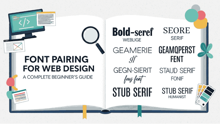
Font Pairing for Web Design A Complete Beginner’s Guide

Table of Contents 1. Introduction Typography is more than letters—it’s design in action. The right font pairing makes a website look professional, improves readability, and strengthens branding. In this guide, you’ll learn the fundamentals of pairing fonts effectively, with examples and resources you can use right away. 2. Why Font Pairing Matters in Web Design …

Continue reading →

How to Choose the Best Modern Font Combinations for Design

Table of Contents 1. Introduction In the fast-evolving landscape of graphic design, using the right mix of fonts isn’t just about aesthetics — it’s about communicating clarity, mood, and brand consistency. Best modern font combinations for graphic design are combinations that balance legibility, expressiveness, and visual hierarchy. In this guide, we’ll explore what makes font …

Continue reading →