Web Typography Best Practices

Web Typography Best Practices for Designers: New Boost UX & Engagement

Table of Contents 1. Introduction: Web Typography Best Practices Web Typography Best Practices plays a crucial role in shaping how web visitors perceive content. Unlike print typography, web typography requires designers to consider responsive devices, screen resolutions, loading speeds, and accessibility standards. Good typography improves readability, strengthens visual hierarchy, and increases time-on-page—one of the important …
Continue reading →

Typography Tips for Better Website Readability A Complete Guide

Typography Tips for Better Website Readability: A Complete Guide

Table of Contents 1. Why Typography Matters for Website Readability When it comes to digital experiences, typography tips for better website readability can make or break user engagement. Studies from the Nielsen Norman Group show that good typography improves comprehension, increases reading speed, and enhances user trust. In a world where attention spans are shrinking, …

Continue reading →

font pairing

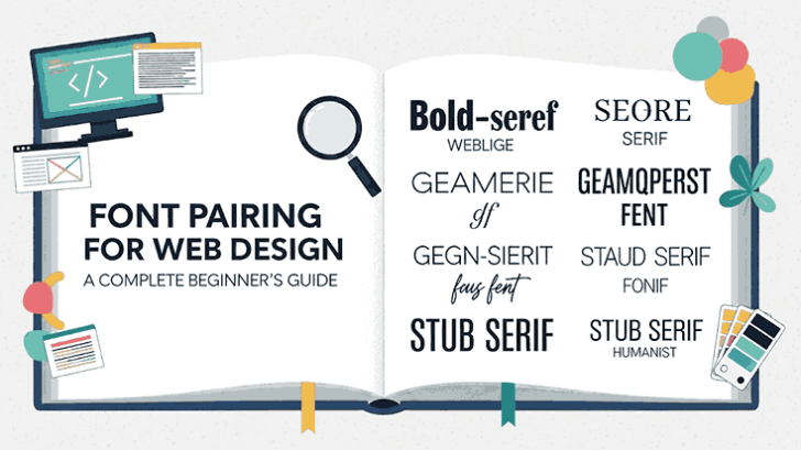
Font Pairing for Web Design A Complete Beginner’s Guide

Table of Contents 1. Introduction Typography is more than letters—it’s design in action. The right font pairing makes a website look professional, improves readability, and strengthens branding. In this guide, you’ll learn the fundamentals of pairing fonts effectively, with examples and resources you can use right away. 2. Why Font Pairing Matters in Web Design …

Continue reading →