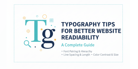
Table of Contents
- Why Typography Matters for Website Readability
- Key Principles of Web Typography
- Choosing the Right Fonts for Websites
- Font Pairing Strategies for Better Readability
- Line Spacing, Font Size, and Contrast
- Best Typography Practices for Different Website Types
- Recommended Fonts from Edric Studio
- Conclusion
1. Why Typography Matters for Website Readability
When it comes to digital experiences, typography tips for better website readability can make or break user engagement. Studies from the Nielsen Norman Group show that good typography improves comprehension, increases reading speed, and enhances user trust.
In a world where attention spans are shrinking, typography becomes the bridge between your content and your audience.
2. Key Principles of Web Typography
Designers should follow these principles:
- Clarity: Fonts should be legible on all devices.
- Consistency: Use a maximum of two to three fonts for cohesion.
- Hierarchy: Create clear levels of headings, subheadings, and body text.
- Accessibility: Fonts must meet WCAG guidelines for color contrast and readability.
3. Choosing the Right Fonts for Websites
The font you choose should align with your brand identity and audience expectations. For professional or corporate sites, a clean serif like Ariani Danila Serif Font works perfectly. For creative or personal blogs, a handwritten option like Serameyer Handwriting Font can add a personal touch.
Always prioritize fonts that are:
- Easy to read
- Supported across browsers
- Optimized for both desktop and mobile
4. Font Pairing Strategies for Better Readability
Effective font pairing improves visual harmony. Here are some proven strategies:
- Serif + Sans Serif: Great for corporate sites. Example: Pair Ariani Danila Serif Font with a simple sans serif.
- Handwritten + Neutral: Adds character while maintaining balance. Example: Serameyer Handwriting Font.
- Brush + Clean Font: Works well for creative portfolios. Try Downgrade Brush Font.
For more pairing inspiration, check out Smashing Magazine’s Guide to Typography.
5. Line Spacing, Font Size, and Contrast
Typography is not only about font choice but also about how you use it.
- Line spacing (leading): 1.5× line height improves readability.
- Font size: At least 16px for body text (as recommended by UX Collective).
- Contrast: High contrast between text and background ensures accessibility.
These small adjustments can significantly impact how users consume your content.
6. Best Typography Practices for Different Website Types {#best-typography-practices-for-different-website-types}
- Corporate Websites → Professional serif fonts convey authority.
- Creative Portfolios → Unique brush or display fonts add personality.
- E-Commerce Stores → Clean, sans serif fonts support easy navigation.
- Lifestyle Blogs → Script or handwritten fonts give a warm, personal feel.
For example, Retro Culture Font is ideal for blogs or lifestyle projects, while Kelsey Wilson Font Duo offers stylish versatility for branding and web headers.
7. Recommended Fonts from Edric Studio
Here are some excellent options from our collection:
- Ariani Danila Serif Font – Elegant serif for professionals.
- Serameyer Handwriting Font – Great for quotes and blogs.
- Downgrade Brush Font – Stylish for portfolios.
- Ethelyne Script Font – Retro vibe for lifestyle and creative projects.
- SAM Hand Lettering Font – A versatile duo for modern branding.

8. Conclusion
By applying these typography tips for better website readability, web designers can ensure that their websites are not only visually appealing but also user-friendly and accessible. Remember to:
- Choose fonts aligned with your brand.
- Apply smart font pairing strategies.
- Optimize line spacing, size, and contrast.
Typography is both an art and a science—one that can dramatically elevate user experience. Explore Edric Studio’s full font library to find typefaces that perfectly balance beauty and readability.