Table of Contents
- Introduction
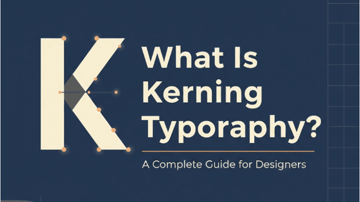
- What Is Kerning in Typography?
- Why Kerning Matters in Modern Design
- Types of Kerning
- Kerning vs. Tracking vs. Leading
- How Kerning Affects Readability & Branding
- Best Practices for Applying Kerning
- Recommended Fonts for Kerning Practice (From EdricStudio)
- Final Thoughts
- References
1. Introduction What Is Kerning Typography
What Is Kerning Typography, small details can dramatically transform the clarity, aesthetics, and professionalism of a design. One of the most essential yet often overlooked aspects of good typography is kerning—the adjustment of spacing between individual letter pairs. Whether you’re designing logos, packaging, websites, or social media graphics, understanding kerning is crucial for achieving visual balance and brand consistency.
In this article, we’ll explore What Is Kerning Typography, why it matters, how to use it correctly, and examples of fonts you can practice with—especially premium, well-crafted fonts from EdricStudio.
2. What Is Kerning Typography?
Kerning refers to the process of adjusting the spacing between two specific letters to create visually pleasing and balanced typography. It ensures that the gaps between characters feel consistent and harmonious to the reader.
Kerning is especially important for:
- Headline design
- Logo typography
- Branding elements
- Large-size text
- Luxury or minimalistic design styles
Poorly kerned type can immediately expose a design as unprofessional—even if the typeface itself is premium.
3. What Is Kerning Typography Matters in Modern Design
Kerning influences both the visual appeal and readability of text. It helps:
✔ Improve legibility What Is Kerning Typography
When letters appear too tight or too far apart, words become harder to read.
✔ Enhance professionalism What Is Kerning Typography
Designers who understand kerning demonstrate a mastery of detail.
✔ Strengthen brand identity
Consistent spacing is essential for logo marks and corporate typography.
✔ Optimize user experience
Especially in digital environments where clarity is crucial.
Kerning is not optional for designers—it’s a core skill.
4. Types of What Is Kerning Typography
There are three primary types of kerning:
1. Metric What Is Kerning Typography
Based on the kerning tables built into the font by the type designer.
Best used for quick, reliable spacing.
2. Optical What Is Kerning Typography
Generated by design software (Adobe, Figma) based on character shapes.
Useful when a font’s built-in kerning is insufficient.
3. Manual What Is Kerning Typography
Hand-adjusted by the designer for perfect precision, typically for:
- Logos
- Headlines
- Display text
Manual kerning gives you full artistic control.
5. Kerning vs. Tracking vs. Leading
These three terms are often confused, but each affects text differently.
🅚 Kerning
Adjusts space between specific letter pairs.
🅣 Tracking
Adjusts space between all letters in a word or sentence.
🅛 Leading
Adjusts vertical spacing between lines of text.
Understanding the differences helps designers avoid spacing mistakes.
6. What Is Kerning Typography Affects Readability & Branding
Kerning isn’t merely aesthetic—it influences how people perceive your brand.
Brand Perception
Tight kerning may evoke modern or futuristic vibes.
Loose kerning can feel elegant, luxurious, or minimalistic.
User Readability
In UI/UX design, proper kerning can improve scanning and comprehension.
Poor spacing forces users to work harder to read content.
Logo Design
In logos, kerning errors are highly visible and can weaken brand authority.
A single misplaced letter gap can change how the logo is interpreted.
7. Best Practices for Applying What Is Kerning Typography
Here are essential rules for perfect kerning in typography:
✔ 1. Always kern at large sizes
Problems become more visible in headlines.
✔ 2. Look at the negative space
Focus on visual balance, not measurement.
✔ 3. Pay attention to tricky pairs
Common difficult combinations:
- A + V
- T + o
- W + a
- P + a
- Y + o
✔ 4. Test your What Is Kerning Typography in context
Preview your typography:
- on light/dark backgrounds
- in different sizes
- across layouts
✔ 5. Zoom out What Is Kerning Typography
Kerning is better judged when you see the word as a whole.
✔ 6. Kern manually for logos
Always refine brand marks by hand.
8. Recommended Fonts for Kerning Practice (From EdricStudio)
Here are high-quality fonts from EdricStudio that work beautifully for kerning practice or real-world projects:
1. Ghostlike Sans Serif Font
A geometric modern sans-serif with sharp clean strokes—great for kerning lessons and branding.
2. Airframe Sans Serif Font
A versatile and minimalistic font that responds well to both metric and manual kerning adjustments.
3. Rowland Sans Serif Duo
A font duo offering excellent balance between display and body text—ideal for studying kerning consistency.
4. Strange Cool Font
A unique display typeface perfect for testing kerning across creative, irregular letter shapes.
These fonts offer clean curves, strong readability, and precise letter anatomy—making them perfect for both practice and professional design work.
9. Final Thoughts What Is Kerning Typography
Kerning is one of the most important elements of great typography. It shapes how readers interpret your message, influences brand credibility, and gives your design a polished professional appearance. By learning how kerning works—along with practicing using premium fonts such as those from EdricStudio—you’ll elevate your design quality significantly.
Understanding kerning isn’t just a technical skill—it’s a creative advantage.
10. References What Is Kerning Typography
- Canva – What Is Kerning?
- Adobe – Typography Essentials
- JustTheSkills – Kerning Explained
- Figma – Kerning & Letter Spacing Guide
- CreativeBloq – Typography Definitions & Best Practices