Table of Contents
- Why “font choice for readability” matters
- Key typographic factors impacting readability
- Practical guidelines for choosing fonts with excellent readability
- Showcasing font options from Edric Studio for readable design
- Avoiding common pitfalls in font choice for readability
- Conclusion
- References
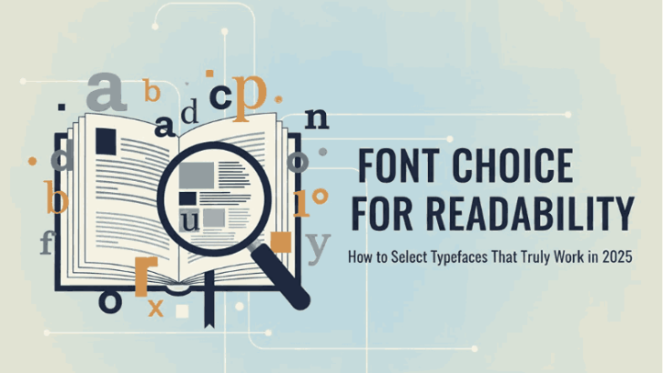
1. Why “Font Choice for Readability” matters
When designing for web, print or branding, readability is a non-negotiable. A Font Choice for Readability may look beautiful, but if readers struggle to digest the content, the message fails. Research in typography makes clear the difference between legibility (recognizing letters) and readability (comfortably reading text in context).
For example, a study by the Nielsen Norman Group found that users reading the same text across different fonts could perform up to 35% faster in their best font versus their worst.
For you and your team at Edric Studio who design, create and sell fonts, emphasising readability gives your customers extra value: not just “looks”, but usability. If your fonts perform well in real-read contexts, your offering becomes more compelling.
2. Key Typographic Factors Impacting Font Choice for Readability
To choose fonts that read well, here are the foundational typographic attributes to assess:
a) x-height, ascenders & descenders
Fonts with taller x-heights (the height of lowercase ‘x’) and clear ascenders/descenders tend to be more legible. The more distinct the shapes of letters, the easier the recognition.
b) Letter spacing, kerning and line spacing (leading)
Spacing between letters, words and lines affects how easily the eye moves through text. Too tight, and letters blur; too loose, and the rhythm is broken.
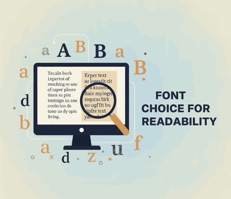
c) Serif vs Sans-Serif debate
Historically, serifs were believed to help guide the eye along a line of text (especially in print), but modern research shows there’s no universal “best” choice; the context matters (screen vs print, size, audience).
d) Contrast, medium & size
Readability depends on medium (print vs screen), size (small vs large), and contrast (text color vs background). Low contrast or very small size can degrade readability significantly.
e) Layout & line length
The length of text lines (characters per line), paragraph width and overall layout affect reader comfort. Shorter, more manageable lines help the eye track and reduce cognitive load.
3. Practical Guidelines Excellent Font Choice for Readability
Here’s a step-by-step workflow designers and brands can follow to ensure the font choice supports readability — especially useful for your customers of Edric Studio fonts:
- Define the use-case
Are you designing body copy (long form reading) or display headings? Readability requirements differ. For body copy you need a typeface that remains comfortable across paragraphs, for headings you may allow more stylised fonts. - Test at actual size and medium
Always preview the font at the size and on the medium where it will appear (print, desktop, mobile). What looks good at 72pt may not at 12pt on phone. - Check x-height and distinct glyph shapes
Evaluate if all characters are clearly distinct (e.g., ‘l’ vs ‘I’, ‘O’ vs ‘0’) and if the x-height supports clarity at small size. - Ensure adequate spacing
Line height (leading) should provide enough breathing room. As a rule of thumb, line-height (or leading) of 120%-150% of font size is often comfortable for body text. - Use contrast and colour wisely
Text should stand out against its background. Avoid low contrast combinations when readability is important (e.g., light grey text on white background). - Pair fonts for hierarchy
When using one font for headings and another for body text, ensure both support readability but also contrast in character. Many of your font families could serve one or the other role. - Consider audience & accessibility
Older readers or readers with visual impairment may be more affected by poor choice. The study by NN/g found that older users are penalised more by bad font choices.
Following these measures, you can choose a font (or provide customers a font option) with confidence that readability isn’t sacrificed.
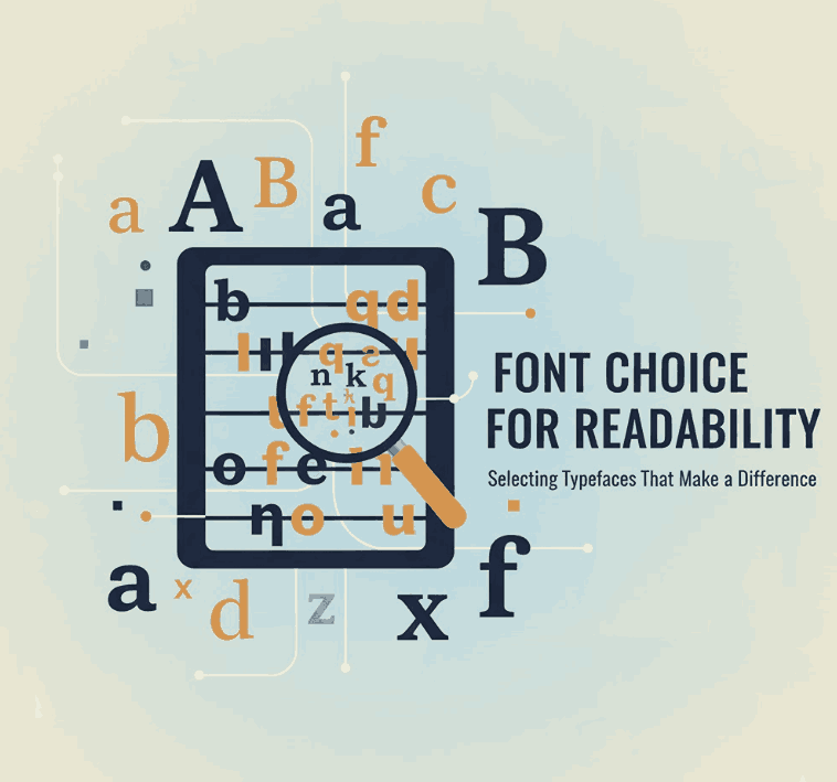
4. Showcasing font options from Edric Studio for readable design
Here are four fonts from your collection that align well with the “font choice for readability” theme. You can use them as examples in your article, pulling in your product pages:
- Allcan Modern Font – A modern sans-serif with clean proportions. Ideal for body copy or user-interface text where clarity is key.
- Coet Sans Serif Font – Another sans-serif with strong potential for readability at small sizes; great for web or mobile contexts.
- Forceless Font – Depending on its design (display or body), this may work for headings or emphasised text; readability still matters for impact.
- Alaqua Sans Serif Fonts – If this font family offers multiple weights and styles, it can support hierarchy (heading, subheading, body) with consistent readability across use cases.
By linking to these fonts in your article, you not only provide concrete examples but also drive readers to explore your product offerings — marrying content marketing with product promotion.
5. Avoiding Common Pitfalls in Font Choice for Readability
Even experienced designers fall into readability traps. Here are some cautions:
- Mistake: Choosing a decorative font for long-form text.
Fancy display fonts might look attractive in headlines but fatigue the reader in body text. - Mistake: Ignoring spacing and line length.
Even a good font can fail in readability if line lengths are too long, leading to eye fatigue or skipping lines. (E.g., paragraphs spanning full width on large screens.) - Mistake: Using low contrast or coloured backgrounds without checking.
A text with low contrast (light grey on white) or very bright background can dramatically reduce readability — especially for older or visually impaired users. - Mistake: Assuming one font fits every medium.
A font optimised for print might underperform on screen, and vice-versa. Research shows there’s no universal “best” font for all mediums. - Mistake: Neglecting audience diversity.
Younger designers may pick fonts suited to their eyes, but older users or those with reading difficulties may struggle. Your font offerings become more valuable if they consider inclusive readability.
By being aware of these pitfalls, both you (as the font creator) and your customers (as users/designers) can make more informed choices.
6. Conclusion
Choosing the right font is not just a matter of aesthetics—it’s a strategic decision that impacts readability, user engagement, brand perception and accessibility. When designers and brands focus on “font choice for readability”, they align typography with purpose.
At Edric Studio, your collection of fonts (such as Allcan Modern, Coet Sans, Forceless and Alaqua) positions you not only as creators of beautiful letterforms but as partners in usable, responsible typography. Encourage customers to view your fonts not just as decorative assets, but as readable tools. This creates trust, performance and brand value.
In summary: prioritise clarity, test across real-use contexts, provide usable examples, and design fonts that stand the test of time. When readability is baked into the font choice, then design becomes more inclusive, effective and enduring.
7. References
- Readable.com – New study shows font readability is very individual.
- MIT Lecture Materials – Reading 17: Typography.
- A Arditi – Serifs and font legibility.
- GeniusEE – Font Readability Research: Serif vs Sans Serif Font.
- Nielsen Norman Group – Best Font for Online Reading: No Single Answer.