Table of Contents
- Introduction
- Why font choice matters in packaging
- Key criteria for selecting fonts for packaging
- Trend #1: Readability & hierarchy for packaging surfaces
- Trend #2: Expressive type for brand personality and shelf impact
- Trend #3: Versatile fonts for multi-format packaging (print, digital, shrink-wrap)
- Applying the trends with your foundry’s mockups
- Best practices & common pitfalls
- Conclusion
- References
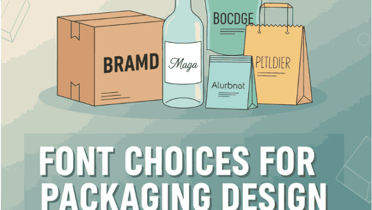
1. Introduction Font Choices for Packaging Design
When a consumer picks up a product from a shelf (physical or digital), the typography on the Font Choices for Packaging Design plays a critical role in their first impression. The typeface used can communicate brand values, readability, hierarchy of information, and ultimately influence whether the product is noticed and trusted. For a foundry like EdricStudio, designing fonts tailored for packaging design is a strategic opportunity. In this guide, we explore how to choose Font Choices for Packaging Design, analysing trends, best practices and actionable take-aways for designers and brands.
2. Why matters in Font Choices for Packaging Design
Packaging typography is more than simply picking a “pretty” font. It contributes to:

- Brand personality: The style of the typeface (serif, sans, script, decorative) signals whether the brand is premium, playful, heritage, modern, artisanal. For example, one article points out how the choice between serif, sans-serif, script or decorative fonts significantly impacts consumer perceptions of brand character and quality.
- Readability & hierarchy: On packaging you often have limited space, crowded retail shelf environments, or visual clutter. A well-chosen font ensures key information (brand name, product variant, claim) is legible and laid out clearly. For instance, one design blog points out “scale of typography … primary information is visible if the point size is at least …” in packaging context.
- Conversion & attention: Especially for e-commerce packaging images or product mock-ups online, typography needs to grab attention, differentiate, and support visual clarity. As one article on packaging type effects notes: “Ignoring typography in packaging design trends risks your brand looking outdated — or worse, invisible.”
- Multi-format adaptability: Packaging is not just print; digital renderings, shrink wraps, labels, and small containers all demand fonts that scale, hold their integrity, and maintain performance.
3. Key Criteria for Selecting Font Choices for Packaging Design
Before diving into specific style trends, here are criteria to evaluate any typeface for packaging use:
- Legibility at small sizes: Products may have labels, ingredients lists, disclaimers. The font must work in body text as well as display.
- Distinctiveness / brand fit: Does the font reflect brand identity (premium, playful, eco, heritage)? Avoid generic that blend into competitors.
- Versatility: A good packaging font family will provide multiple weights, widths, possibly alternative characters, and vary to suit both large headings and small text.
- Format performance: For print-packaging: good hinting, print-friendly letterforms. For digital: web-safe, fast loading, responsive.
- Hierarchy support: The family should allow for clear differentiation between product name, variant, key features, regulatory text.
- Global character set/licensing: Especially for brands working across markets.
- Mock-up readiness: For your foundry-shop, demonstrate how the font looks on real packaging, with texture, embossing, die-cut, digital mock-ups.
4. Trend #1: Readability & hierarchy for packaging surfaces
In recent years, readability and information hierarchy have become prominent in packaging typography. According to one blog, scale matters: “primary information is visible if the point size is at least 192 plus point …” when designing for packaging.
In practice this means:
- Choose fonts with open counters, adequate x-height and clear spacing so they read easily at small sizes.
- For packaging headlines (brand/product name) choose a stronger weight; for body or variant text use a companion weight.
- Use contrasting weights or styles within a family to maintain hierarchy.
For example, in your font library you might promote: - Allcan Modern Font: A clean and modern sans serif suitable for large brand text on packaging.
- Element Tail Font: Perhaps a slightly more stylised font for secondary labels, offering readable yet character-rich appearance.
By pairing fonts this way, you ensure readability doesn’t suffer while still delivering brand personality.
5. Trend #2: Expressive type for brand personality and shelf impact
As shelves (physical or online) become more crowded, typography must help a product stand out. Recent packaging typography trend pieces highlight:
- Minimalist typography with bold sans letters for strong shelf presence.
- Handwritten or custom fonts for artisanal, craft or premium feel. For example, one article calls out “handwritten and custom fonts – personalised, friendly typefaces giving brands a human touch.”
- Retro or heritage-inspired fonts signalling authenticity.
In your library you might showcase: - New Leaves Font: A font perhaps suited for organic or botanical products with personality and shelf charm.
- Factory Island Font: Maybe a font with industrial, bold character for packaging needing strong impact.
By promoting fonts that deliver both brand personality and functional readability, you speak to packaging designers wanting differentiation.
6. Trend #3: Versatile fonts for multi-format (print, digital, shrink-wrap)
Font Choices for Packaging Design today doesn’t live only in print. From e-commerce product thumbnails to labels on curved surfaces and even AR/VR experiences, fonts must adapt. Key packaging typography trend blogs point to these needs:
- Flexibility across sizes and formats: one design blog lists variable fonts and overlapping text effects for shelf impact and response.
- Consistency of brand type across packaging and digital – the same font used for a printed box should also work for digital asset.
For your foundry: emphasise font families that include multiple weights, widths, and support for mock-up scenarios (flat & curved packaging). Include mock-up galleries showing your fonts in packaging contexts.
7. Applying the trends with your foundry’s mockups
Here’s how you can put these insights into action to promote your font collection:
- Create packaging-specific mockups using your fonts: show your fonts on boxes, labels, sachets, shrink sleeves. Demonstrate how they look real-world.
- Use the links to your font pages as examples:
- Write copy that emphasises these fonts are built for packaging: e.g., “designed for label clarity, print-optimised hinting, shelf-ready impact.”
- Develop blog posts or resources specific to packaging typography (like this one) that your audience (designers, brands) will find valuable and shareable.
- Present case-studies: show how a chosen font improved shelf presence, readability or brand perception.

8. Best practices & common pitfalls
Best practices:
- Limit font families on a single package face – too many fonts can confuse hierarchy and brand identity.
- Ensure typography adapts to packaging constraints (curves, shrink, flexographic printing).
- Test on real packaging materials: different substrates affect legibility and letterforms.
- Maintain contrast: on packaging where lighting and environment vary, type must stand out. For example, packaging typography articles emphasise contrast and hierarchy.
- Use companion weights: Heading, sub-heading, body copy within same family or matched pairing.
Common pitfalls:
- Choosing extremely decorative fonts for small print – readability suffers.
- Ignoring digital/e-commerce rendering – what looks good in print may not work in thumbnail image.
- Failing to consider licensing/character set – packaging often requires extended market language support.
- Using trendy font styles without testing shelf or digital viability.
9. Conclusion Font Choices for Packaging Design
Typography is a key ingredient in Font Choices for Packaging Design. The right font choice can elevate brand perception, boost readability, ensure functional hierarchy, and help your product stand out in a crowded marketplace. For a font foundry like EdricStudio, recognising the packaging context and designing fonts with those needs in mind gives you a competitive edge. By combining readability, brand personality and multi-format versatility you can deliver fonts that are not just beautiful—but built for packaging success.
Leverage your existing font library, build mock-ups, educate your customers (brands/designers) about typography best practices for packaging, and position your studio as the go-to source for packaging-ready typefaces.
10. References
- ZillionDesigns — Science of Typography in Packaging Designs.
- PackagingWorldInsights — Color and Typography Trends in Packaging Design.
- Noramble — Standout Packaging Fonts: Typography That Makes Your Product Pop.
- TypeType Medium — 10 + Best Fonts for Label and Packaging Design.
- Lummi — Font Trends for 2025 that Creatives Should Keep in Mind.
- Creative Boom — 50 Fonts That Will Be Popular with Designers in 2025.