Table of Contents
- Introduction
- What Is Typography in Design?
- Why Typography Is So Important in Design
- Typography and Readability
- Typography as a Visual Hierarchy Tool
- Typography and Brand Identity
- Typography in Digital and Print Design
- Font Examples from EdricStudio
- Common Typography Mistakes Designers Should Avoid
- Conclusion
- References
1. Introduction Importance Typography in Design
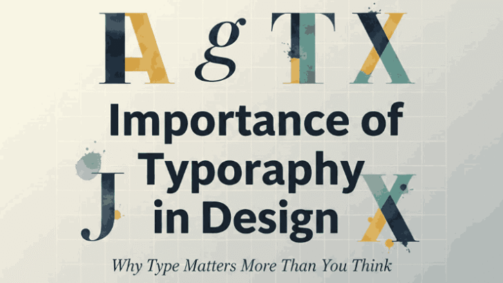
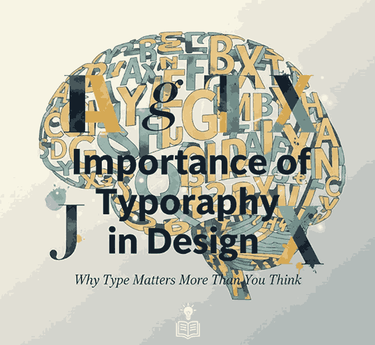
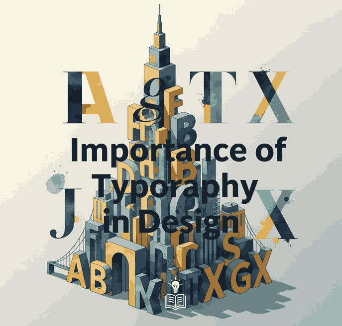
Importance Typography in Design is one of the most powerful elements in visual design. It shapes how people read, understand, and emotionally respond to content. From websites and branding to packaging and social media, typography plays a critical role in communication.
Understanding the Importance Typography in Design helps designers create work that is not only visually attractive but also functional, readable, and memorable. In this article, we’ll explore why typography matters and how choosing the right fonts can dramatically improve design quality.
2. What Is Importance Typography in Design?
Typography is the art and technique of arranging text to make written language clear, readable, and visually appealing. It involves:
- Choosing typefaces
- Adjusting size, spacing, and alignment
- Creating hierarchy and contrast
- Balancing text with other visual elements
Good typography supports the message, while poor typography can confuse or distract the audience.
3. Why Importance Typography in Design
Typography is important because it directly affects how users experience content. It influences:
- First impressions
- Readability and comprehension
- Brand perception
- User engagement
- Accessibility
Well-designed typography helps content communicate clearly, while poorly chosen fonts can weaken even the best visual concepts.
4. Importance Typography in Design and Readability
Readability is one of the primary reasons typography matters. If users struggle to read text, they are likely to leave or ignore the content.
Typography elements that affect readability include:
- Font choice
- Font size
- Line length
- Line height (leading)
- Letter spacing
Clean sans serif fonts are often preferred for digital platforms because they maintain clarity at small sizes and on screens.
Recommended Font for Readability
Lord Madame Font is a clean, modern sans serif that works perfectly for body text and long-form reading.
5. Importance Typography in Design as a Visual Hierarchy Tool
Visual hierarchy helps guide readers through content by showing which information is most important.
Typography creates hierarchy using:
- Font size differences
- Font weight (regular vs bold)
- Spacing and alignment
- Contrast
A clear hierarchy allows users to scan content quickly and understand structure at a glance.
Best Font for Hierarchy Demonstration
Strange Cool Font offers multiple weights and styles, making it ideal for showing headings, subheadings, and body text in a single layout.
6. Importance Typography in Design and Brand Identity
Typography plays a major role in defining a brand’s personality. Fonts communicate emotion and tone before users read a single word.
For example:
- Bold fonts → confidence, strength
- Minimal fonts → professionalism, modernity
- Rounded fonts → friendliness, approachability
Consistent typography helps brands build recognition and trust across platforms.
Typography in Branding
A strong headline font can instantly set the mood of a brand. Using the right typeface ensures visual consistency in logos, websites, and marketing materials.
7. Typography in Digital and Print Design
Typography behaves differently across media:
Digital Design
- Must be readable on various screen sizes
- Requires proper line height and spacing
- Sans serif fonts are often preferred
Print Design
- Allows more flexibility with type styles
- Requires attention to ink spread and paper texture
- Serif fonts are often used for long text
Designers must adapt typography choices depending on where the content appears.
8. Font Examples Importance Typography in Design from EdricStudio
To clearly demonstrate the importance of typography in design, here are professional font examples from EdricStudio:
1. Lord Madame Font
Ideal for body text, editorial design, and web content. Its balanced proportions make it highly readable and professional.
2. Strange Cool Font
A versatile sans serif with multiple styles—perfect for creating hierarchy, contrast, and consistency in design layouts.
3. AXTON Sans Serif Fonts
Bold, modern, and impactful. AXTON works well for headlines, branding, and visual emphasis.
How These Fonts Support Typography Principles
- Lord Madame → readability and comfort
- Strange Cool → hierarchy and flexibility
- AXTON → emphasis and brand impact
Using these fonts together allows designers to apply typography principles effectively while maintaining a cohesive visual style.
9. Common Typography Mistakes Designers Should Avoid
Even experienced designers can make typography mistakes. Common issues include:
- Using too many fonts in one design
- Poor spacing and alignment
- Weak contrast between text and background
- Ignoring hierarchy
- Choosing decorative fonts for body text
Avoiding these mistakes improves both usability and visual appeal.
10. Conclusion Importance Typography in Design
The importance of typography in design cannot be overstated. Typography affects how people read, feel, and interact with content. It supports clarity, strengthens branding, and enhances overall user experience.
By choosing high-quality fonts like Lord Madame, Strange Cool, and AXTON from EdricStudio, designers can apply typography principles with confidence and professionalism.
Strong typography transforms design from ordinary to exceptional.
11. References
- Wikipedia – Typography
- Typewolf – Typography Inspiration
- Smashing Magazine – Typography
- Google Fonts Knowledge – Typography